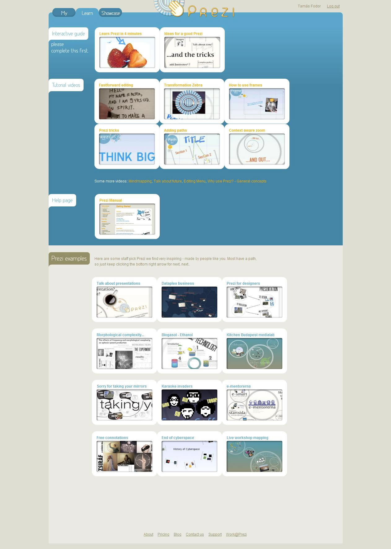
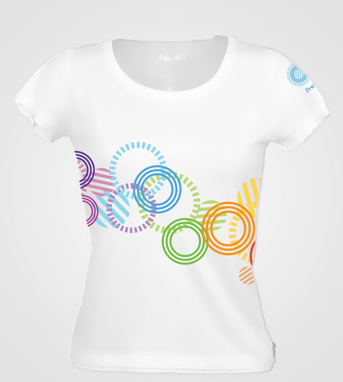
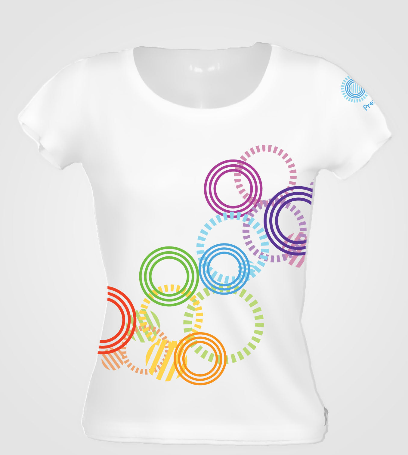
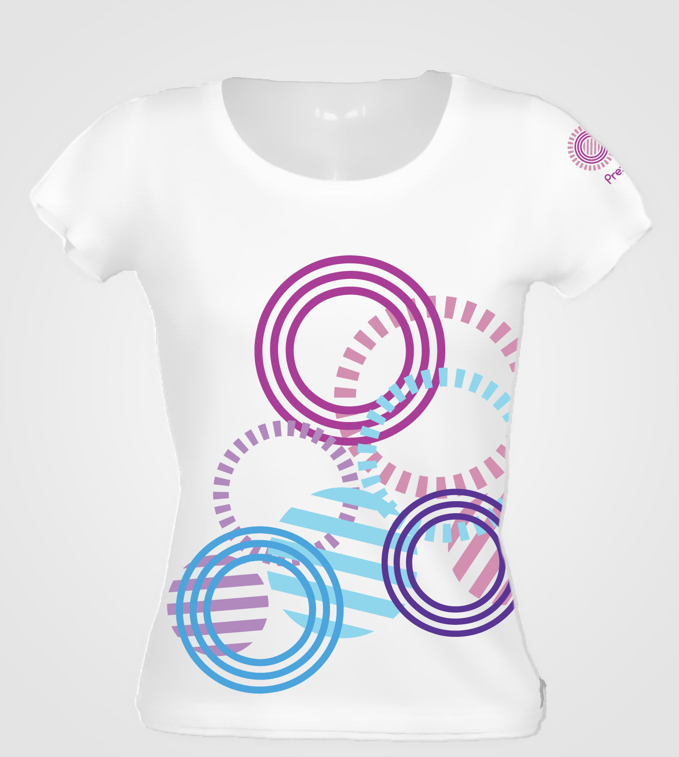
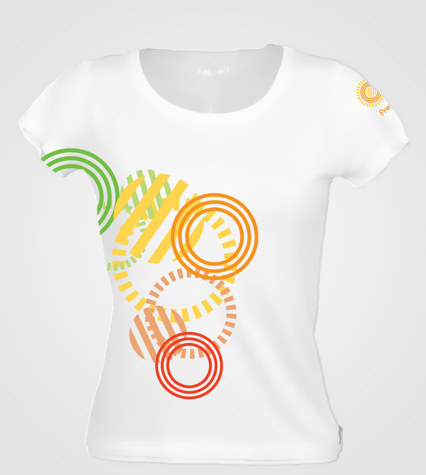
In 2009 I work at Prezi.com, as a Graphic and Web/UI/UX Designer, front-end developer. Other than working on UI element (“ColorZebra”) and subpages (Licences and registrations, Tutorial and Learning, Settings). I also created a brand refresh proposal.
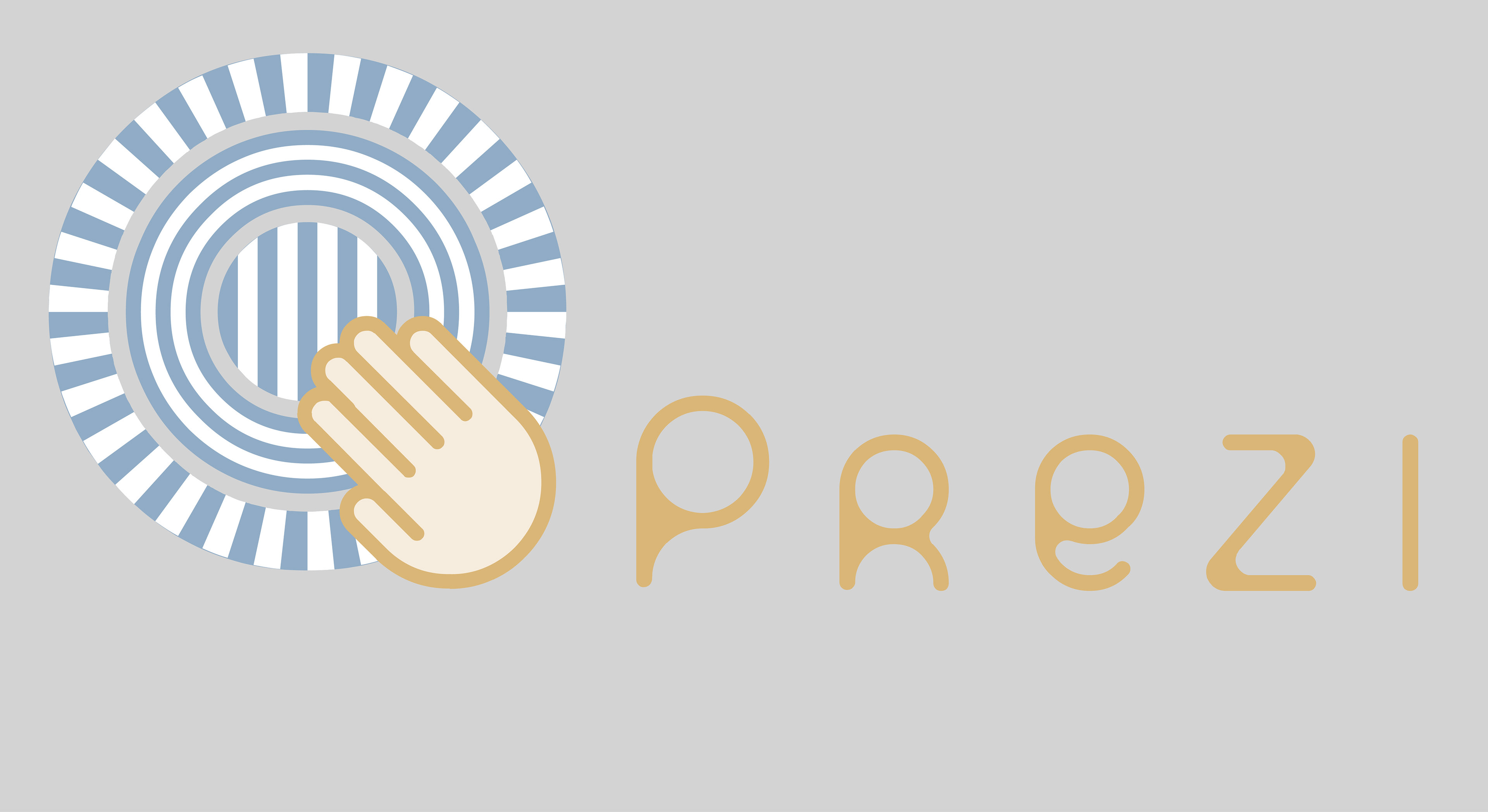
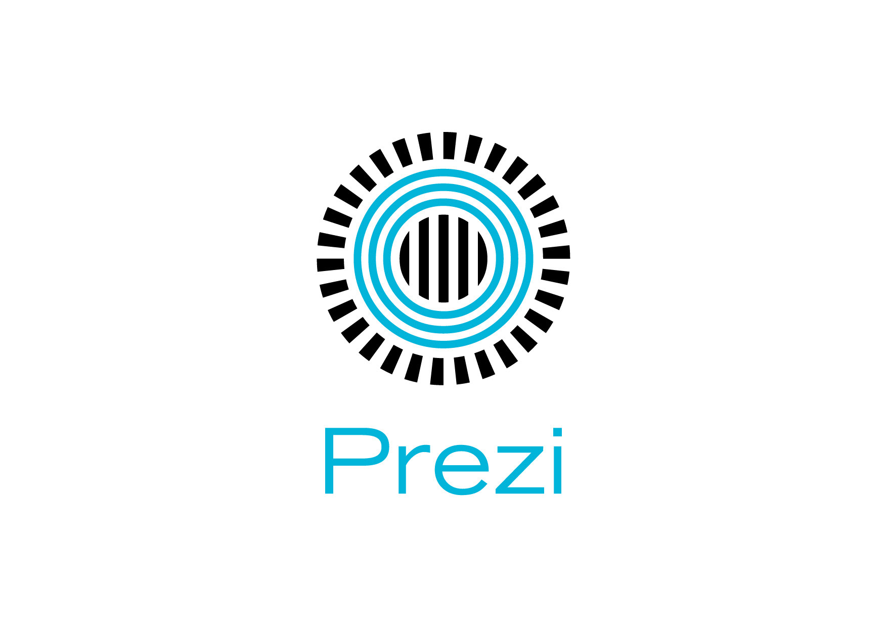
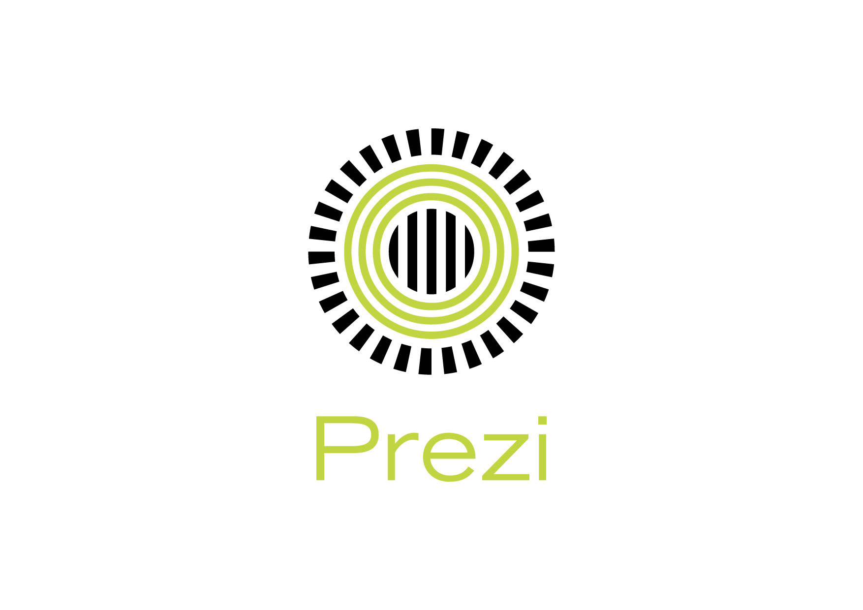
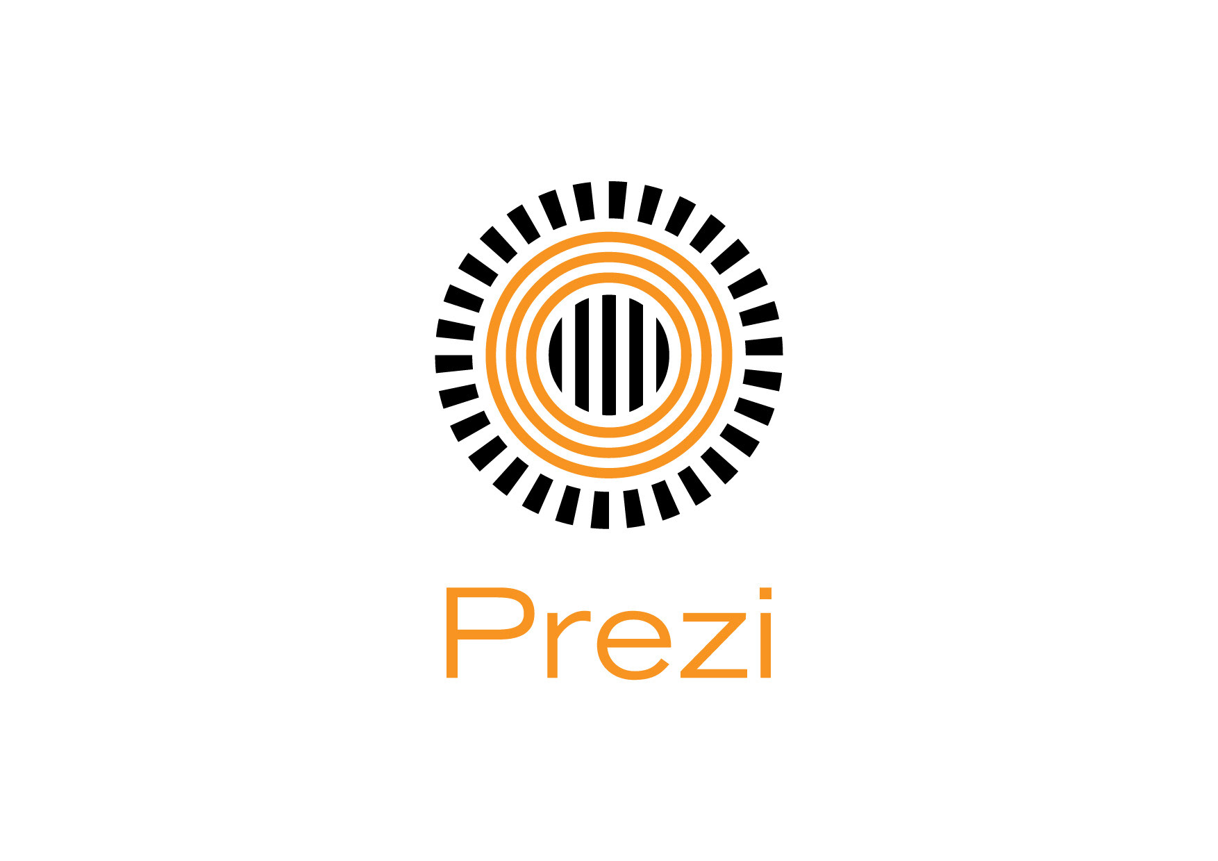
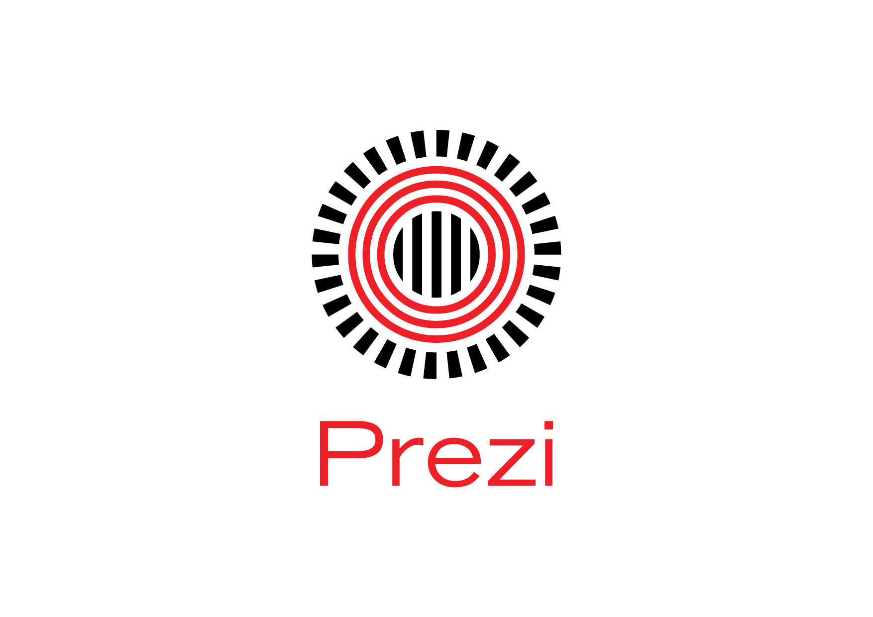
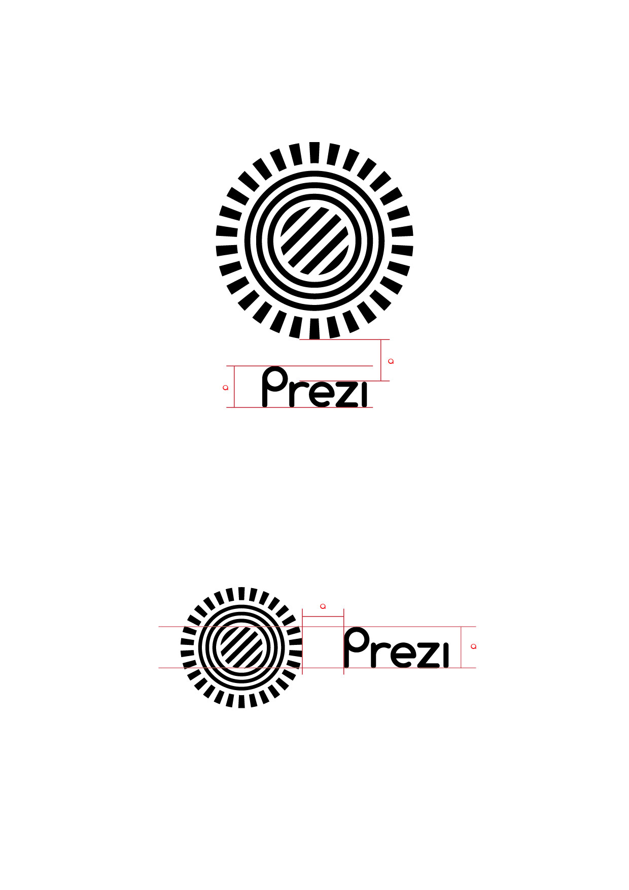
The original logo from 2009
We had two problems with the original logo.
First and foremost, since it represented the “Zebra” na
Furthermore, the logo was too complex, which led to the problem of using the logo in smaller version, like a favicon. With this complicity and pale colour, the logo was cute, but powerless; not able to represent a dynamically developing start-up company.
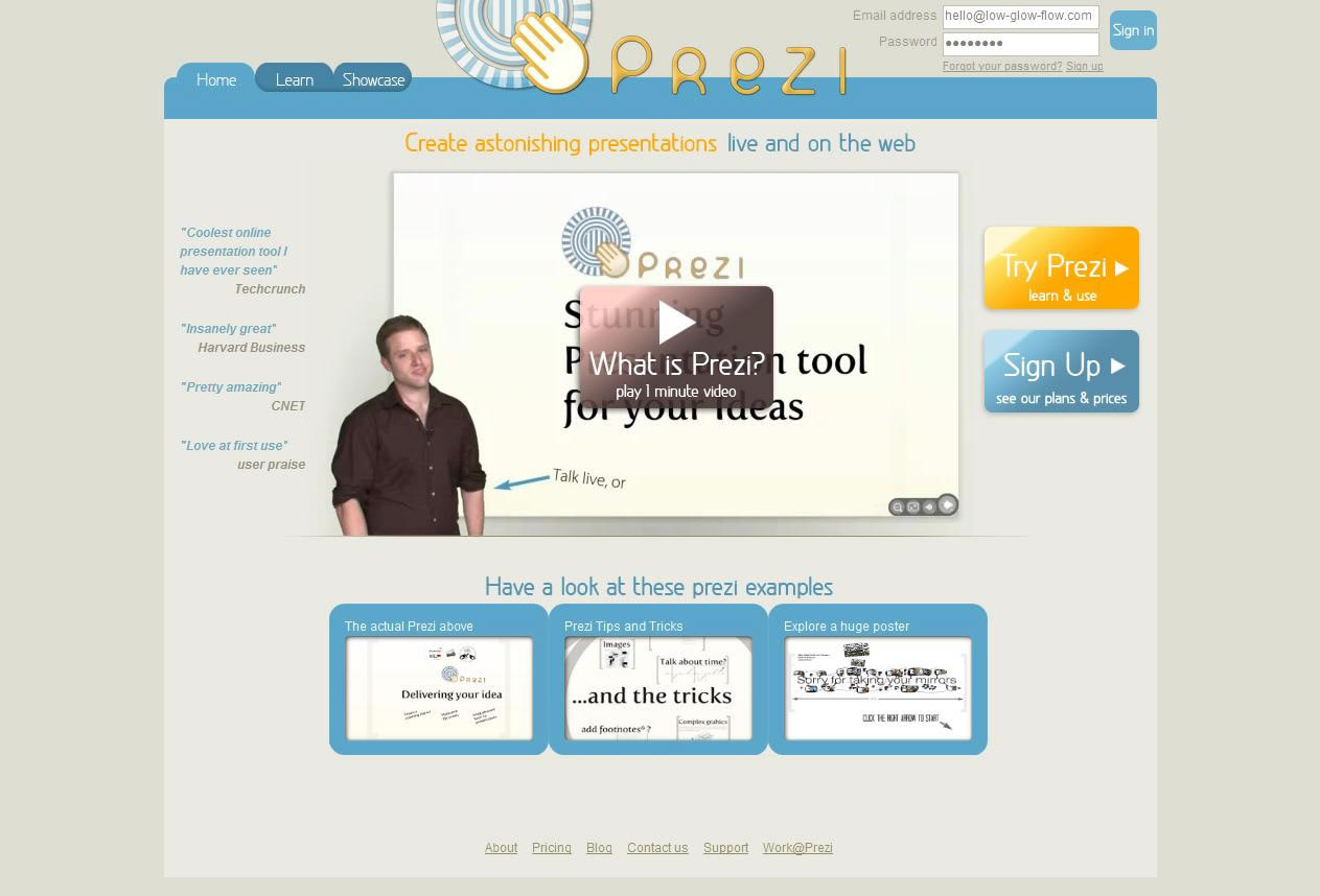
Prezi.com website in 2009
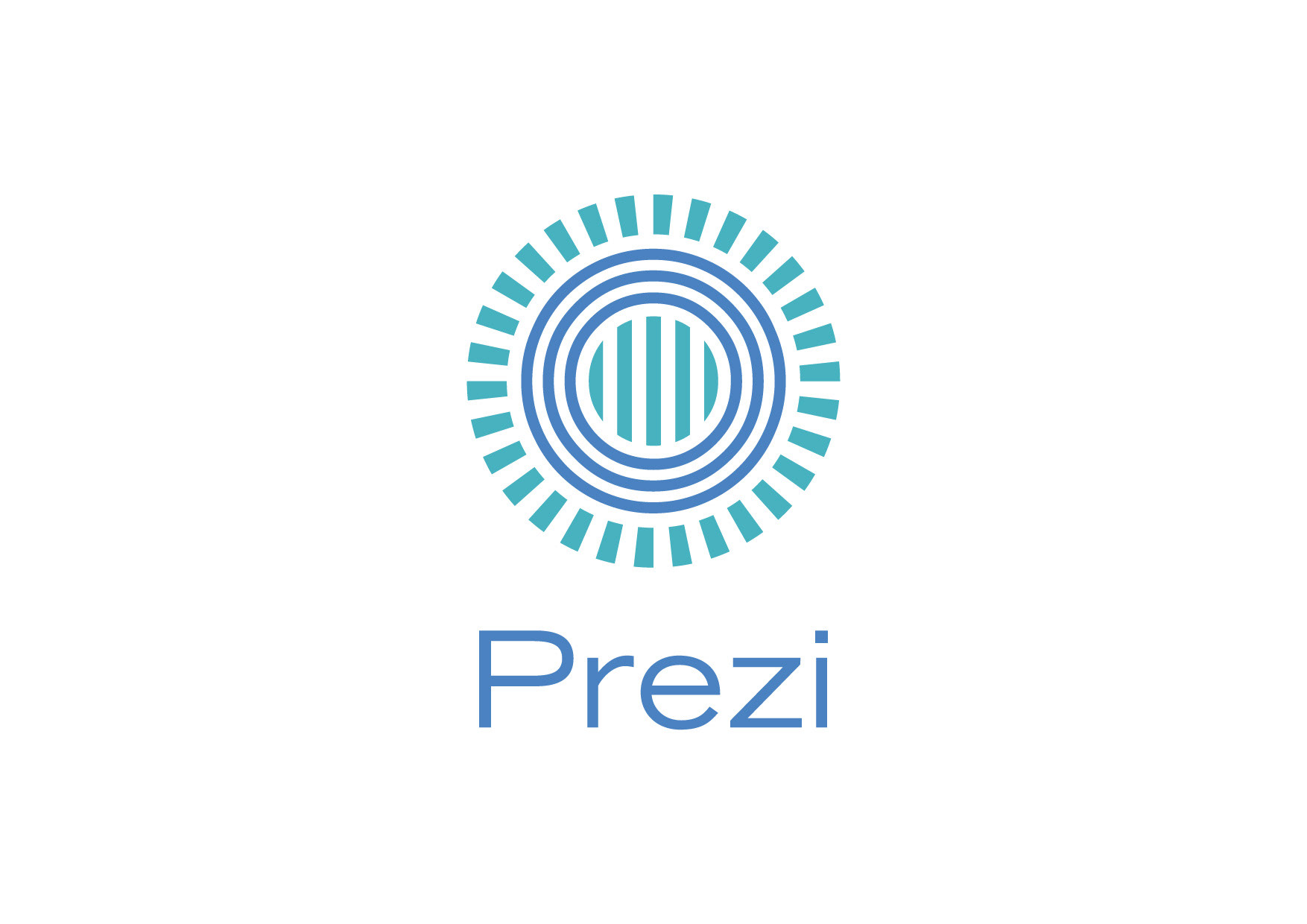
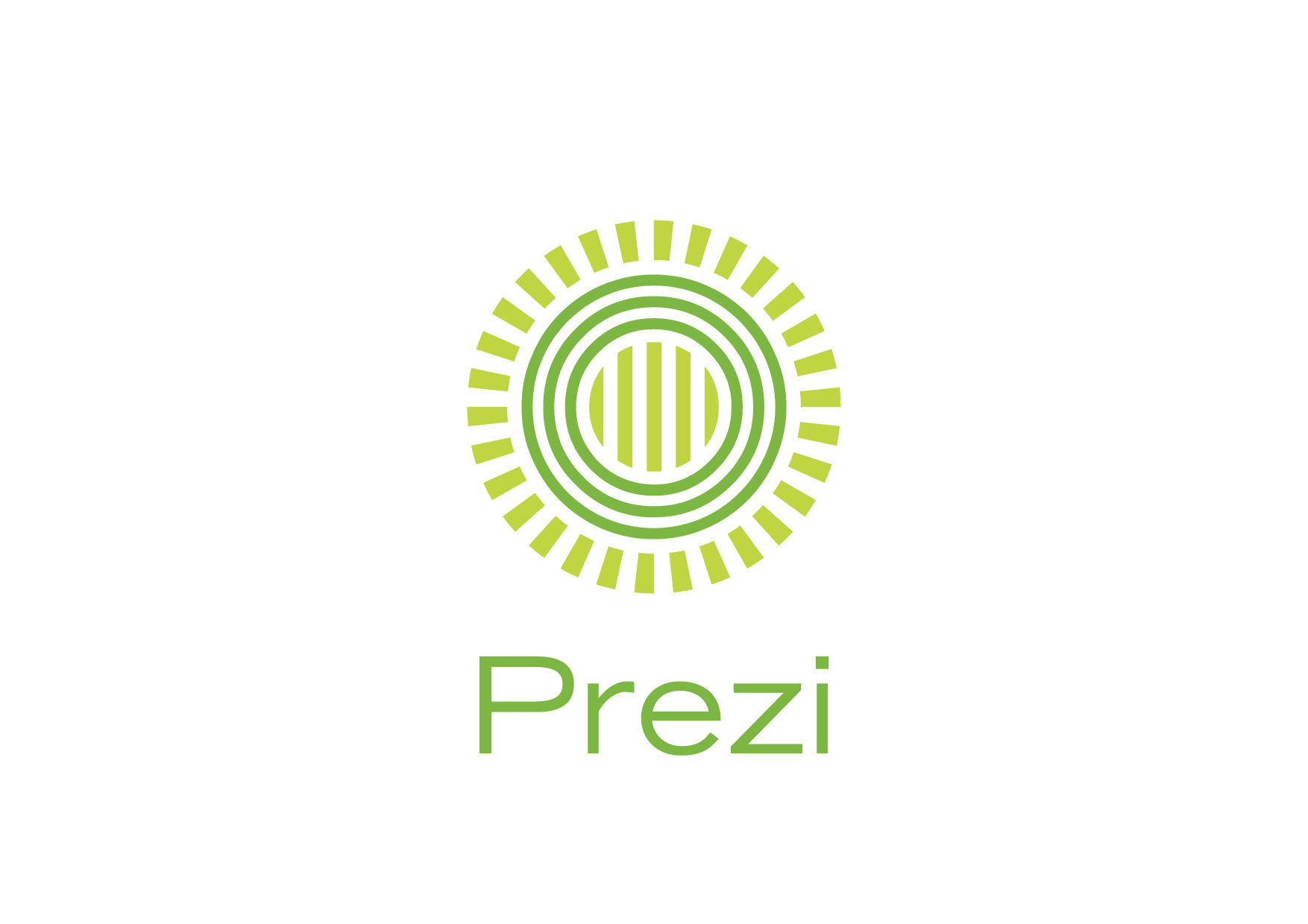
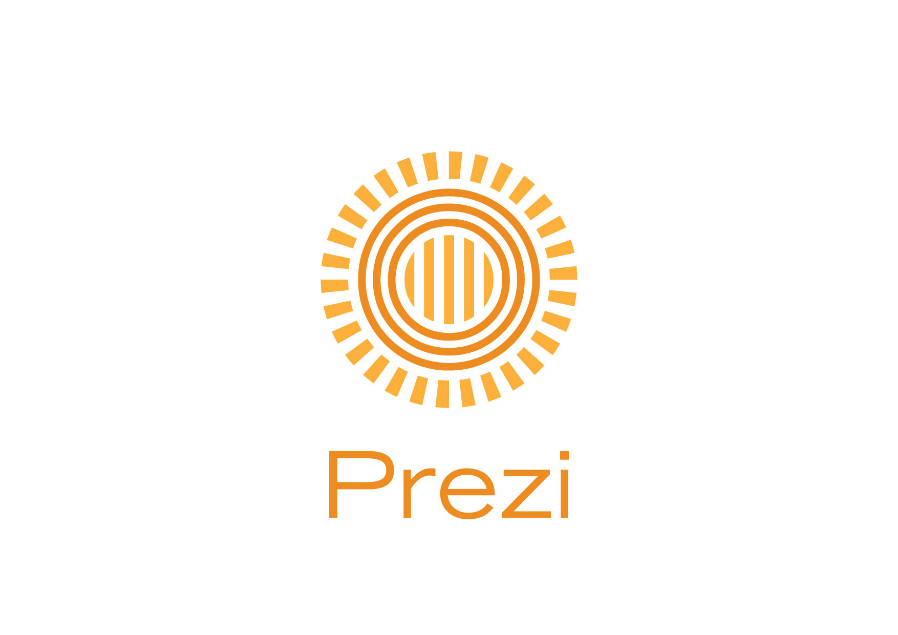
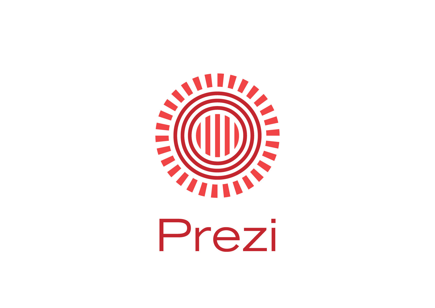
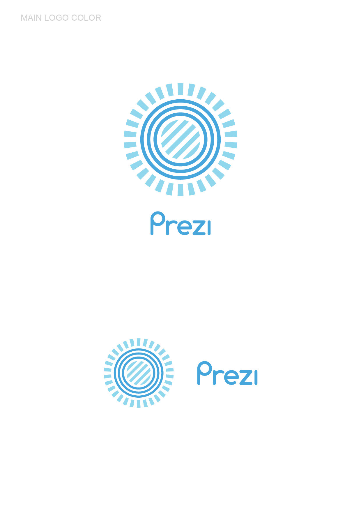
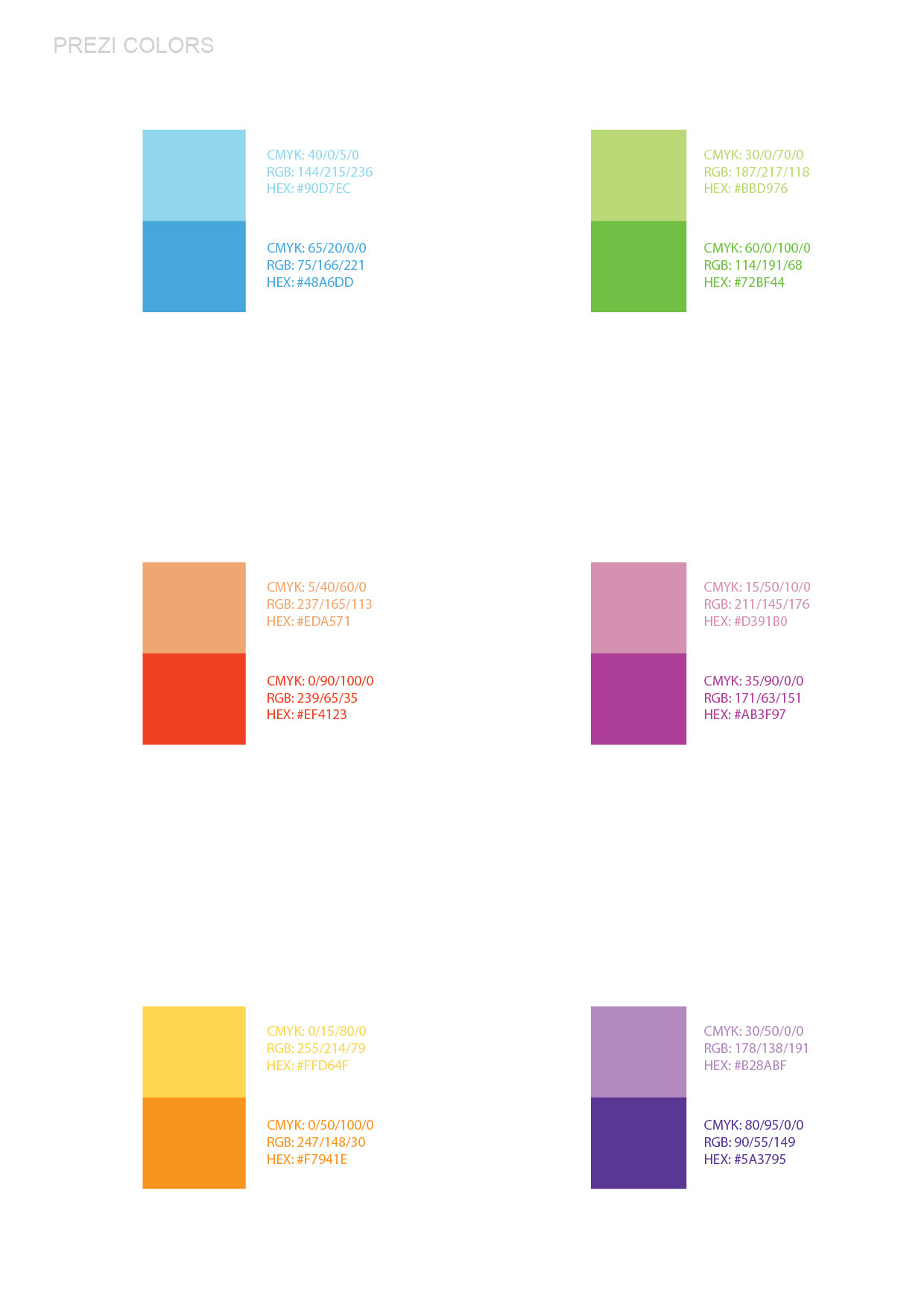
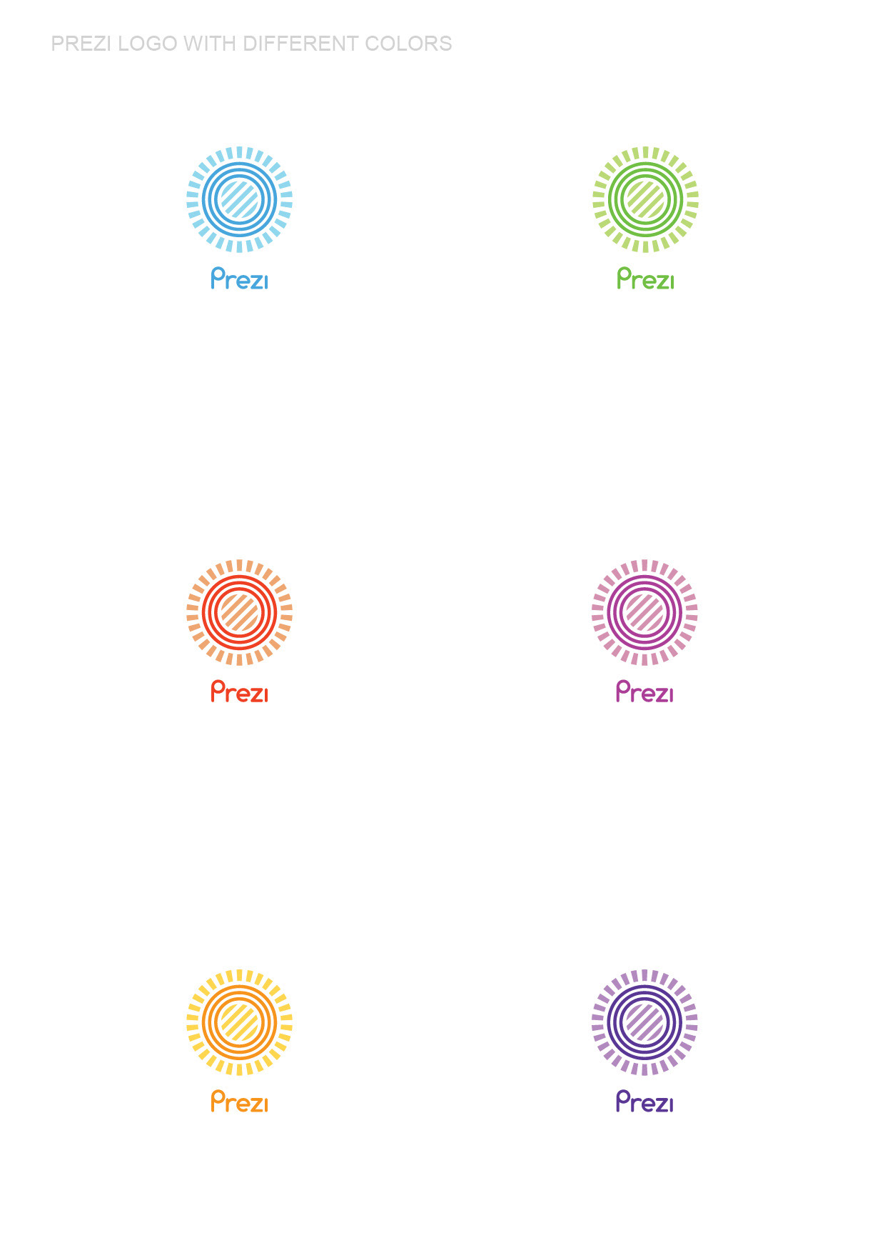
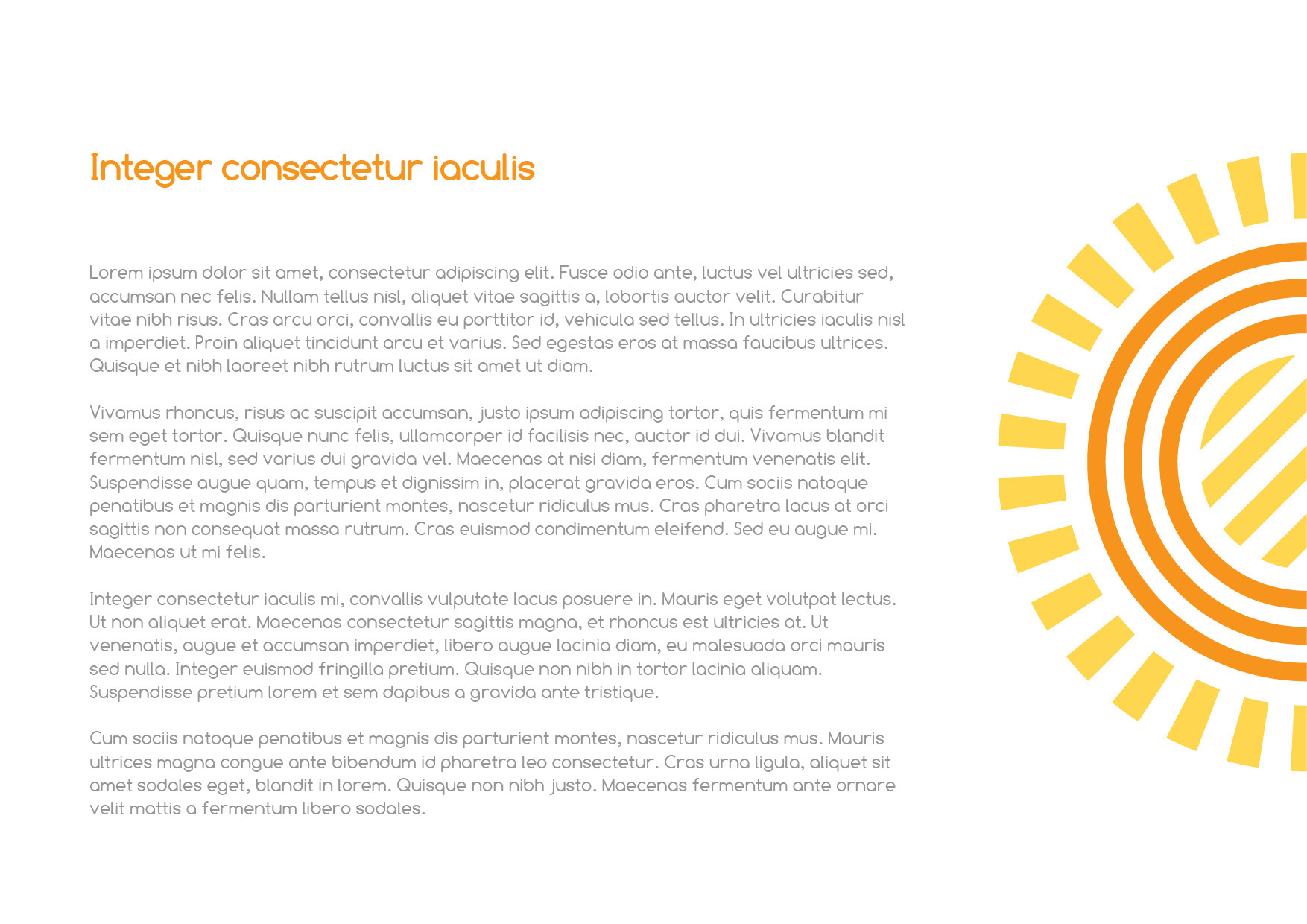
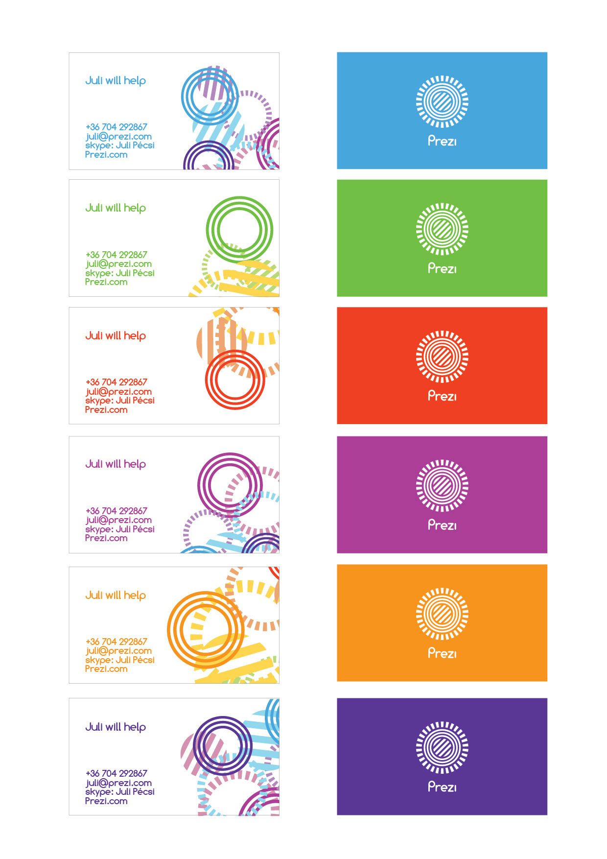
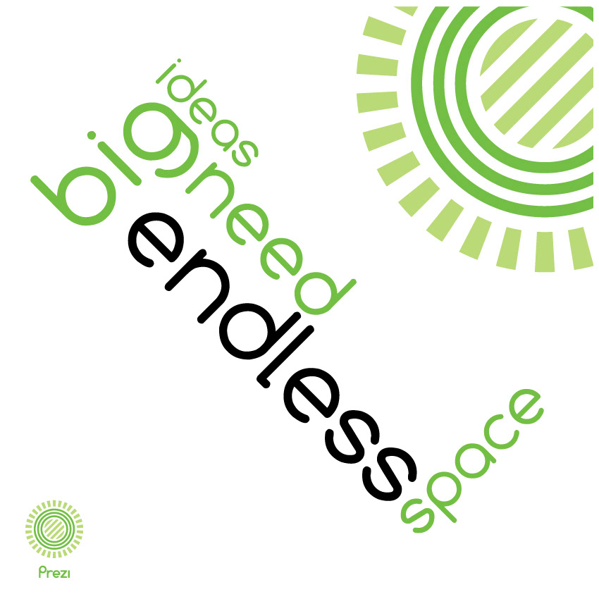
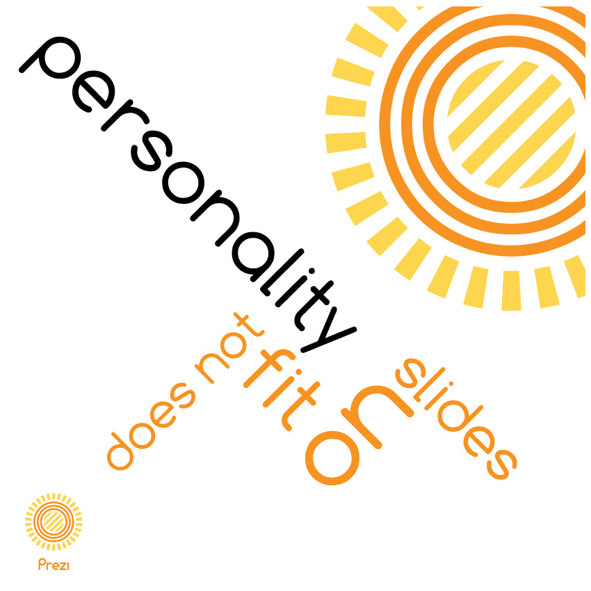
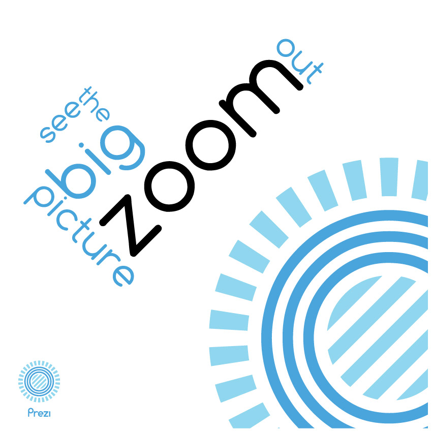
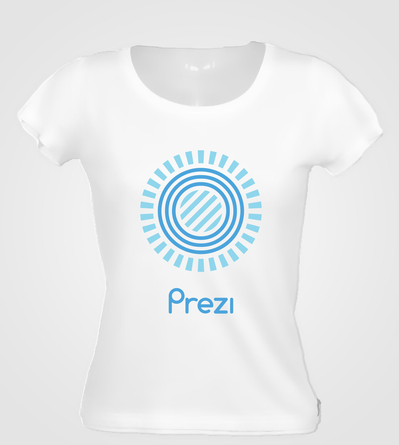
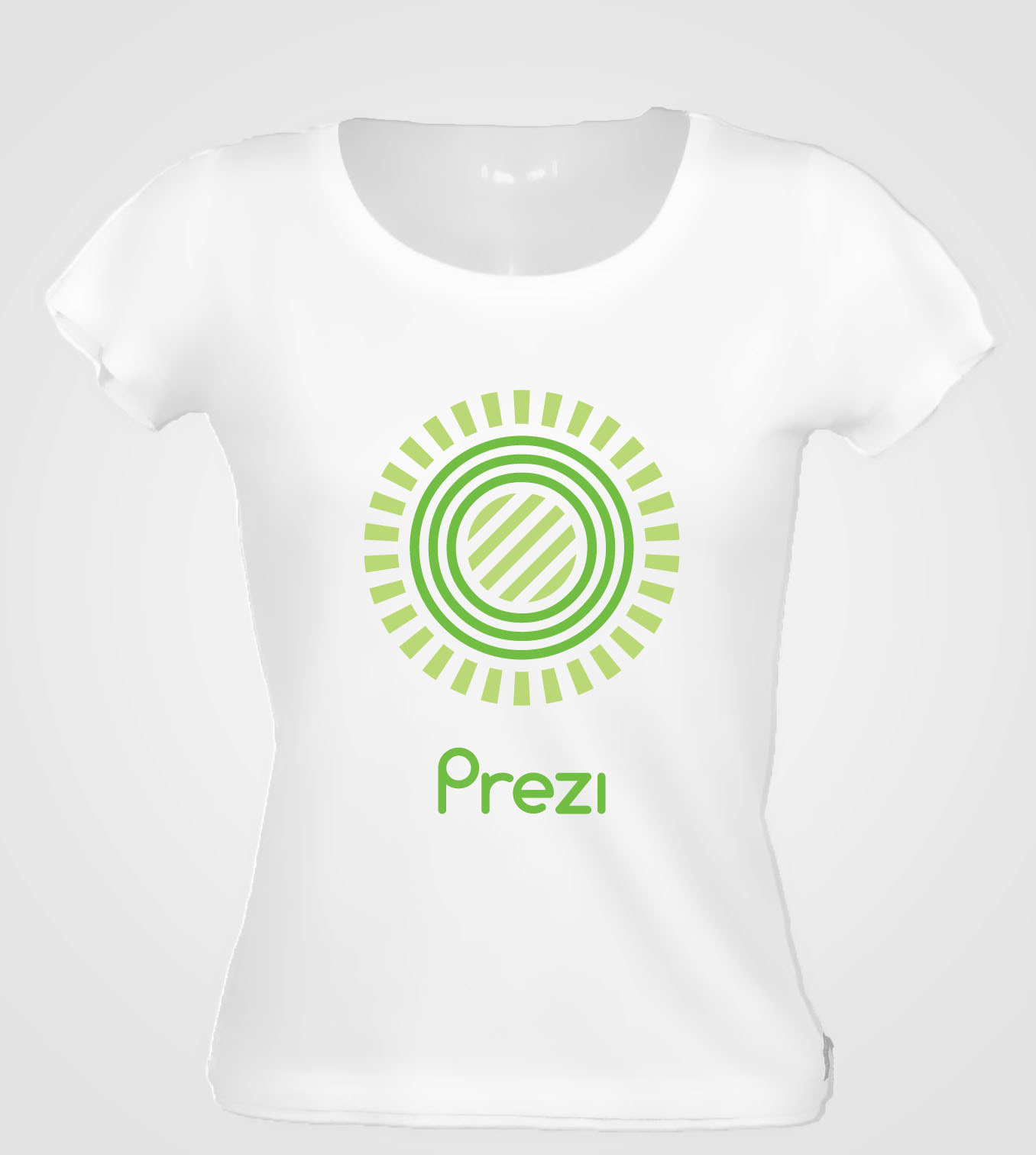
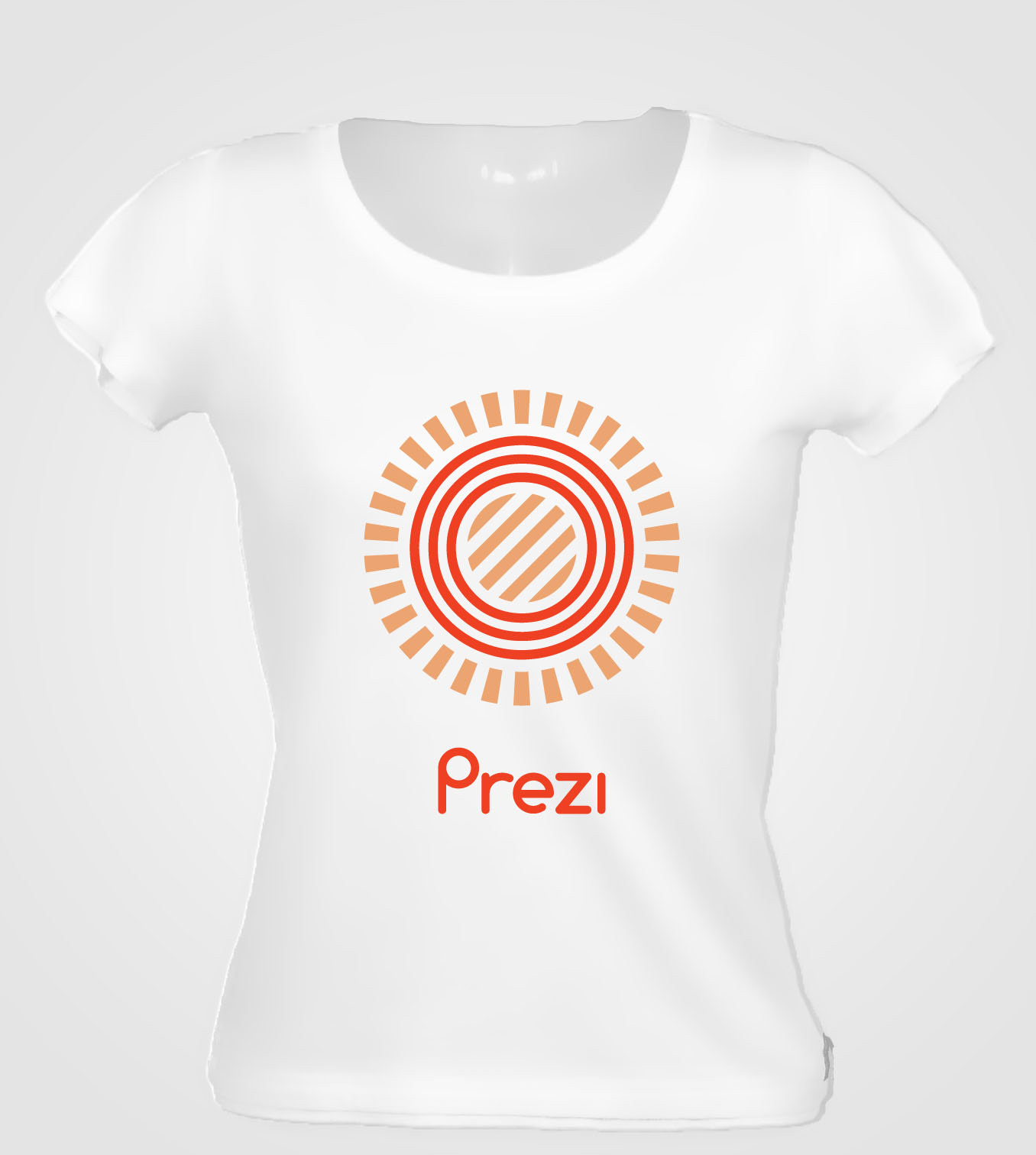
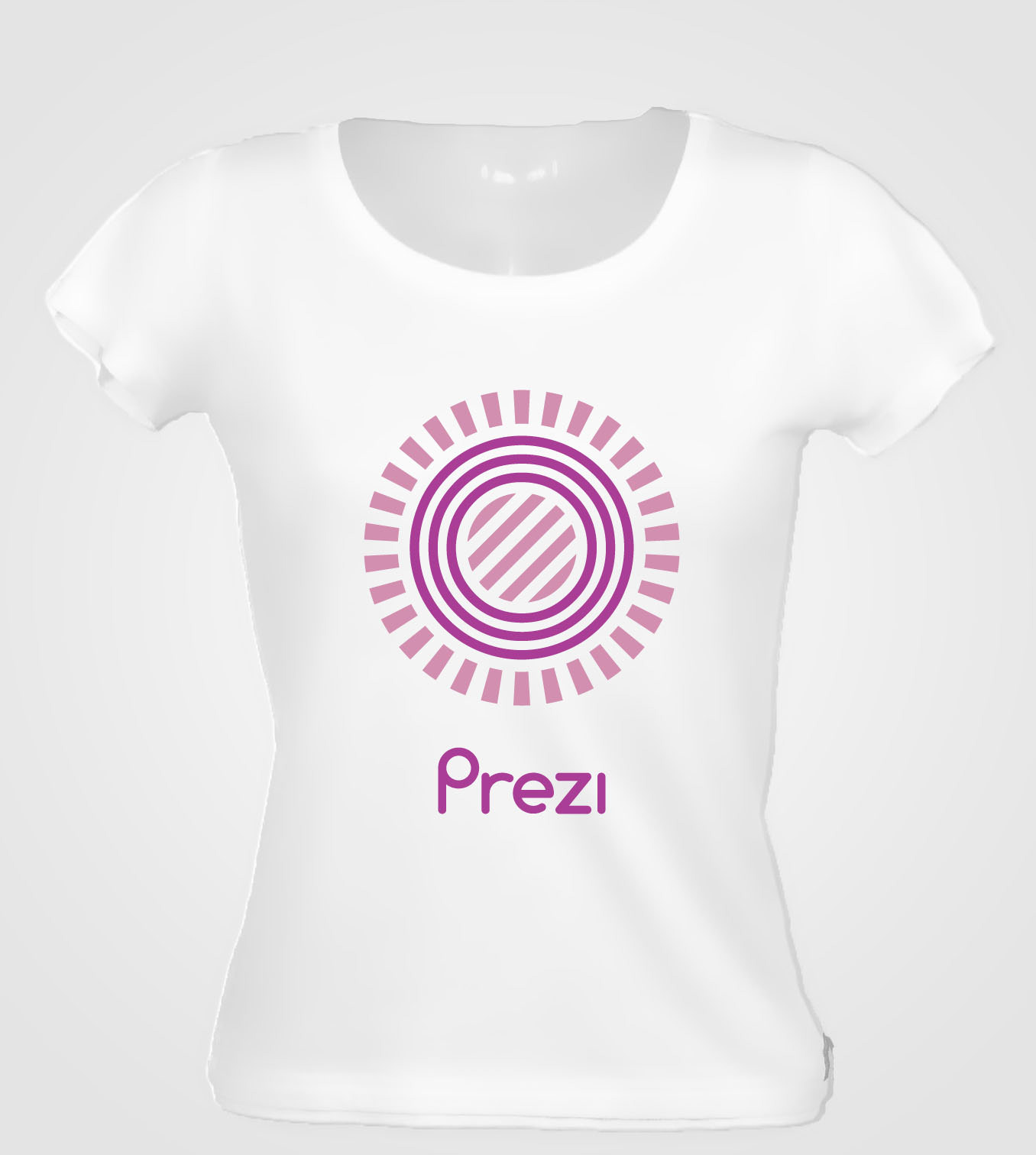
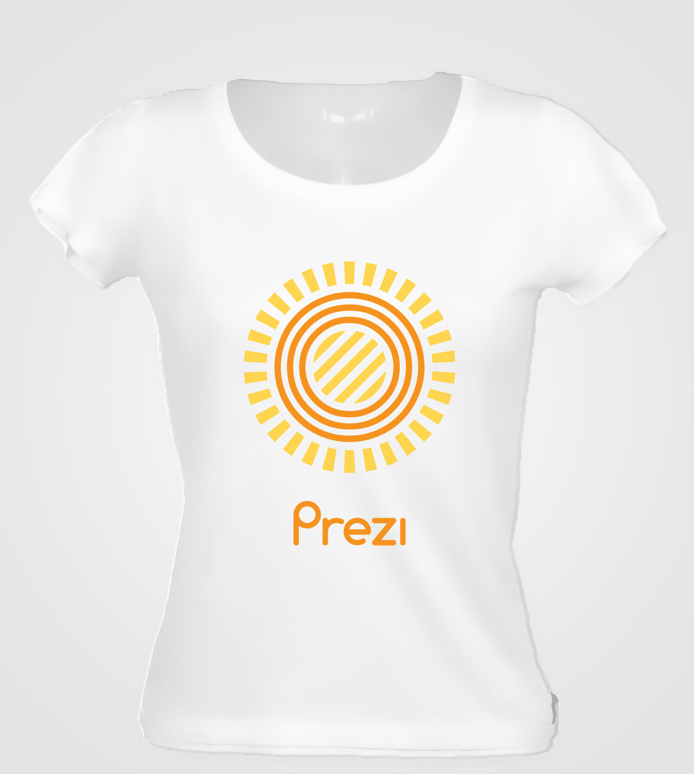
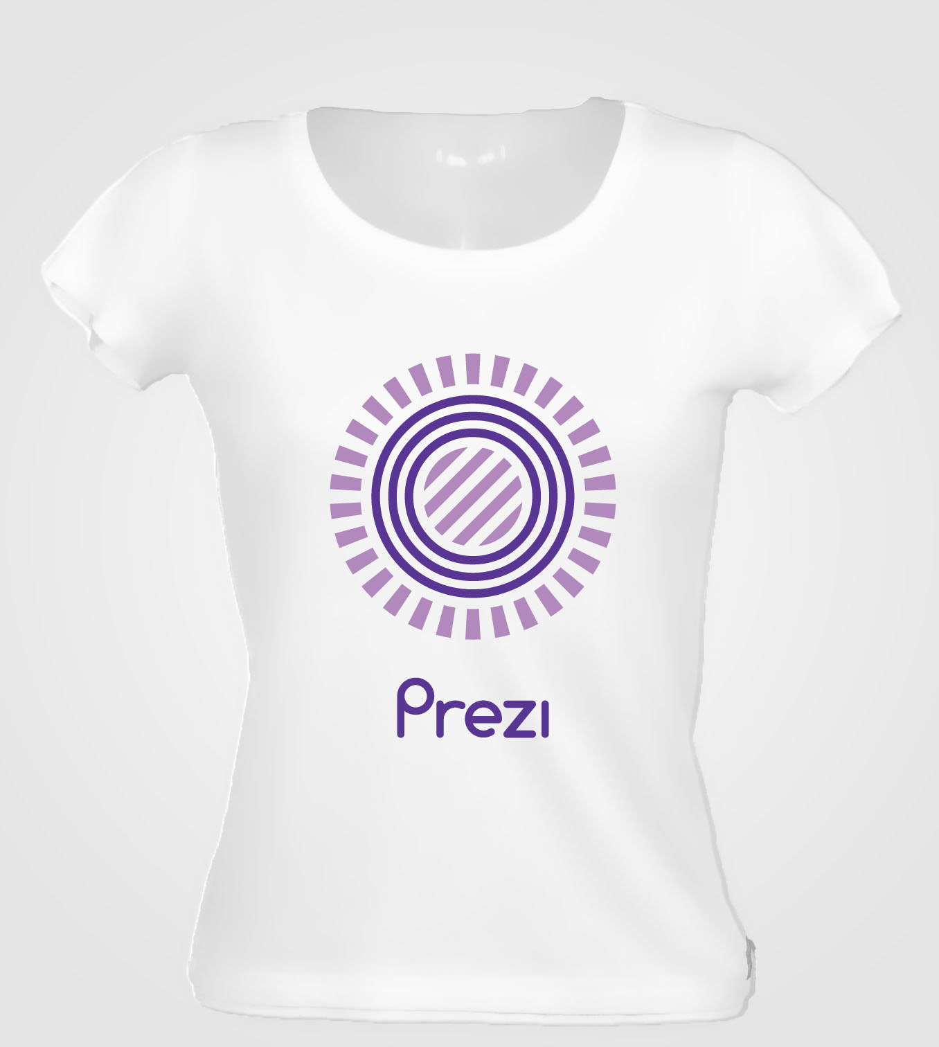
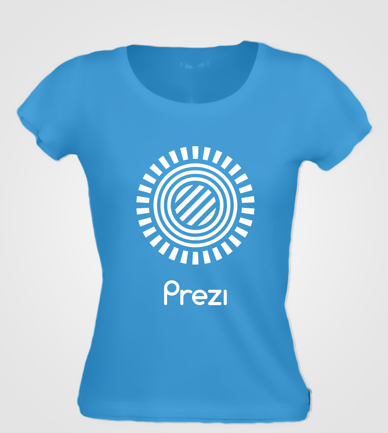
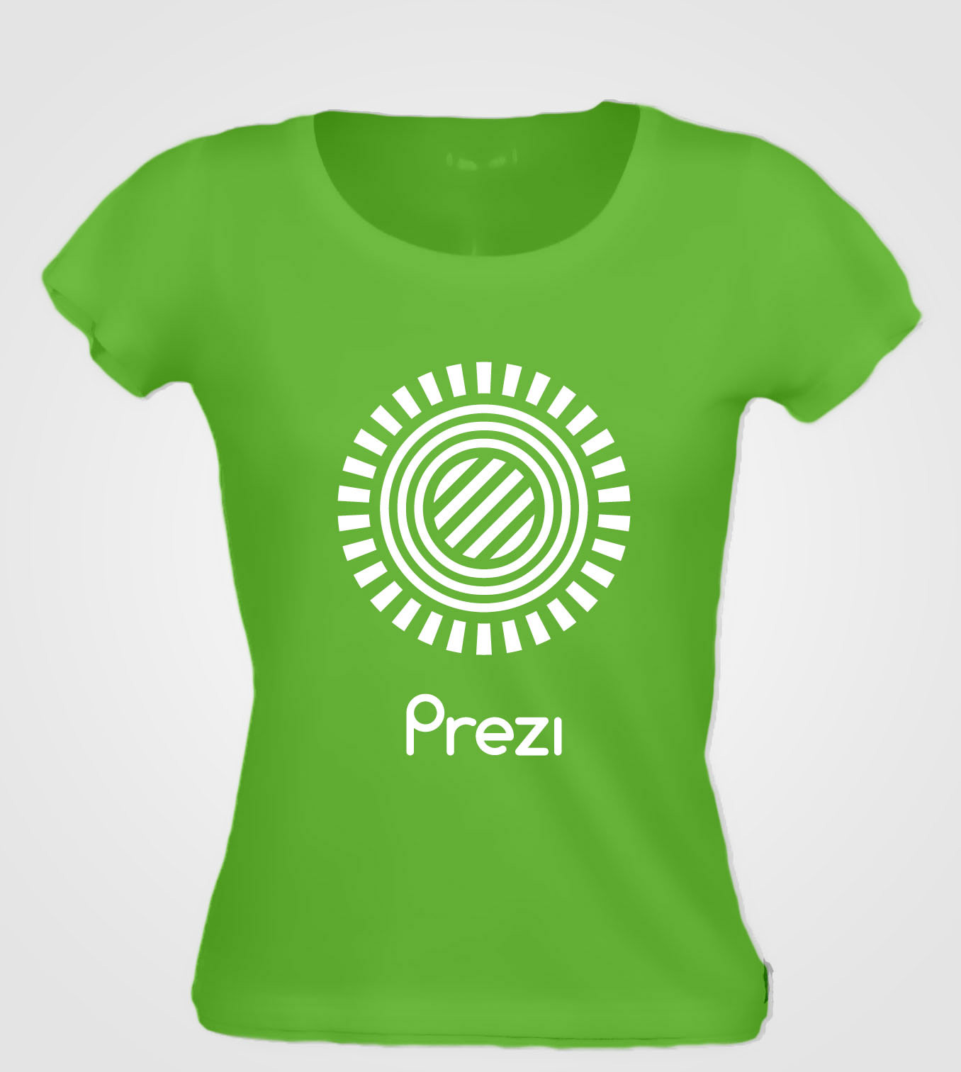
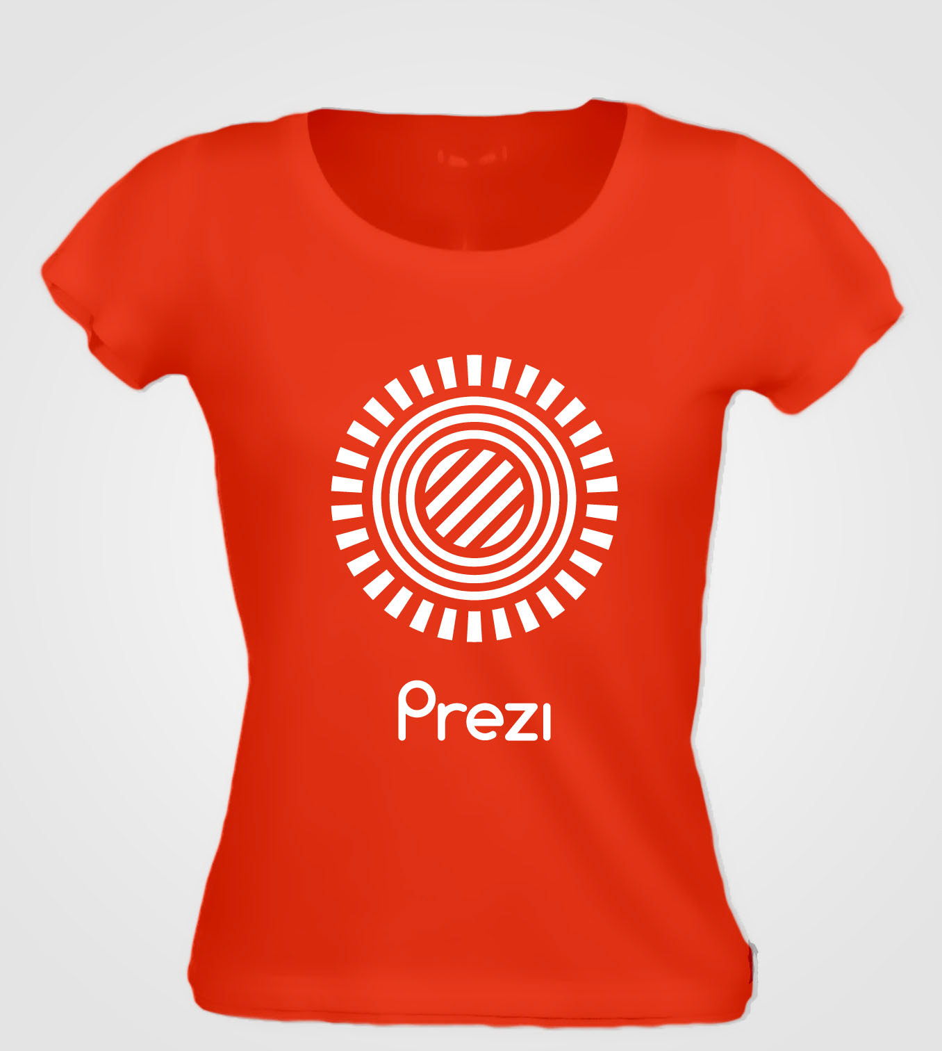
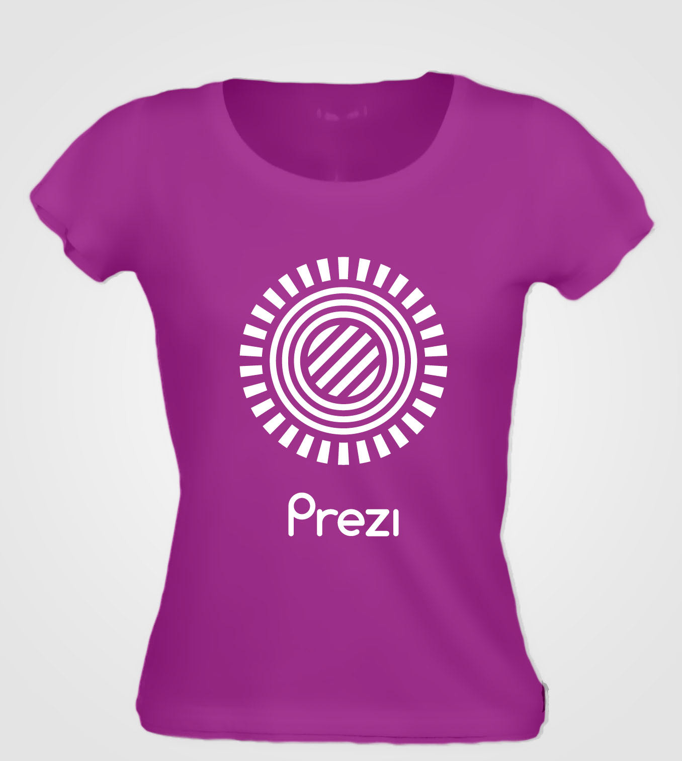
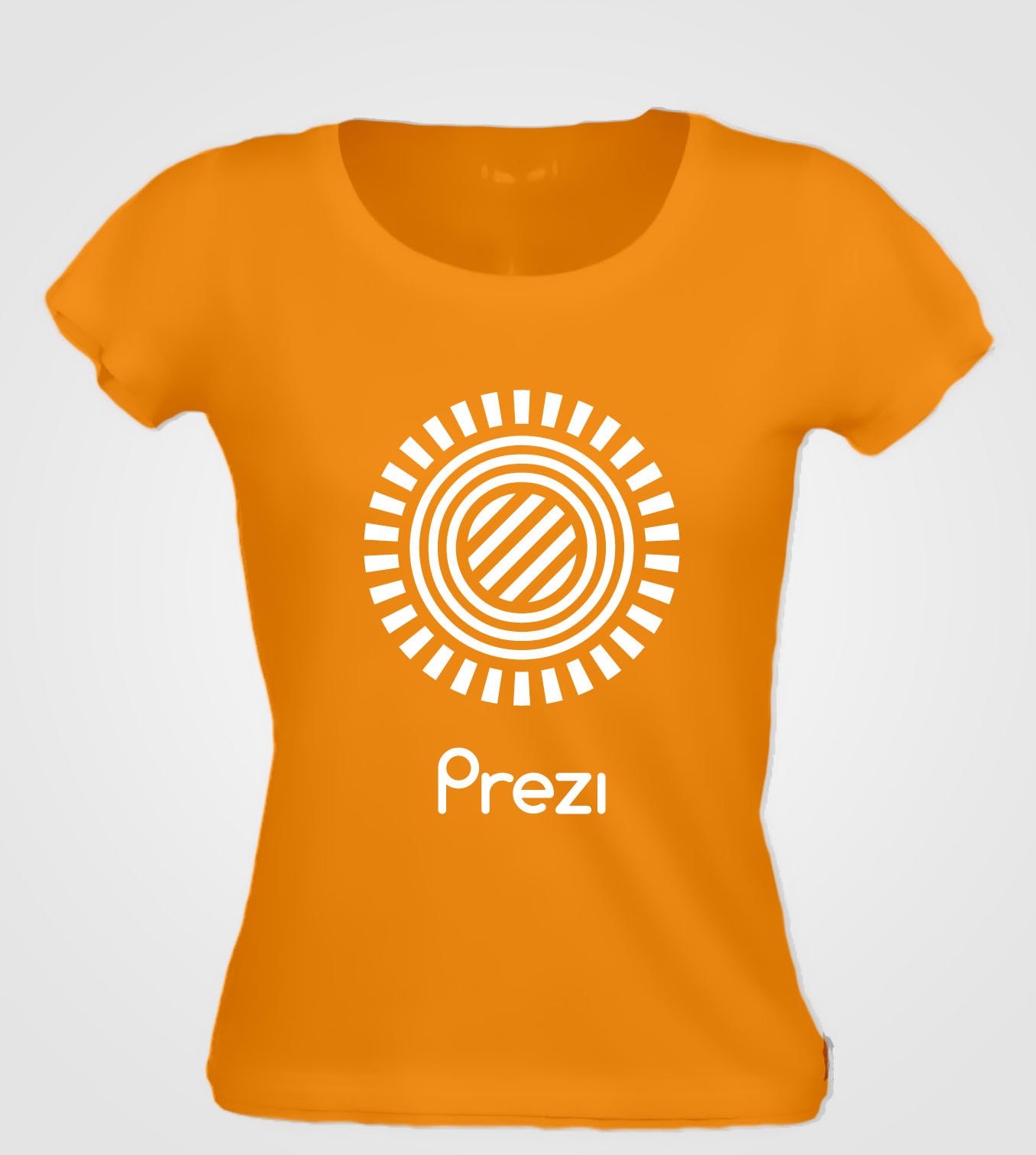
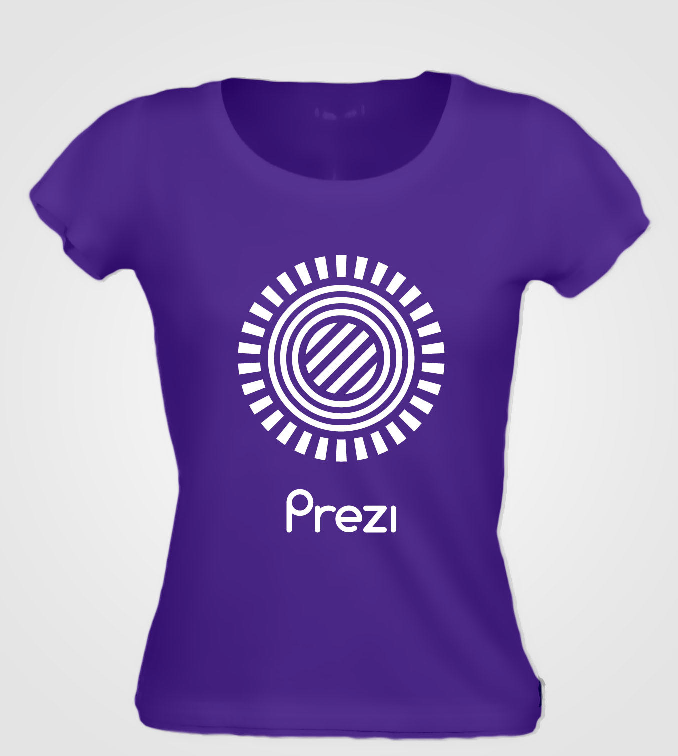
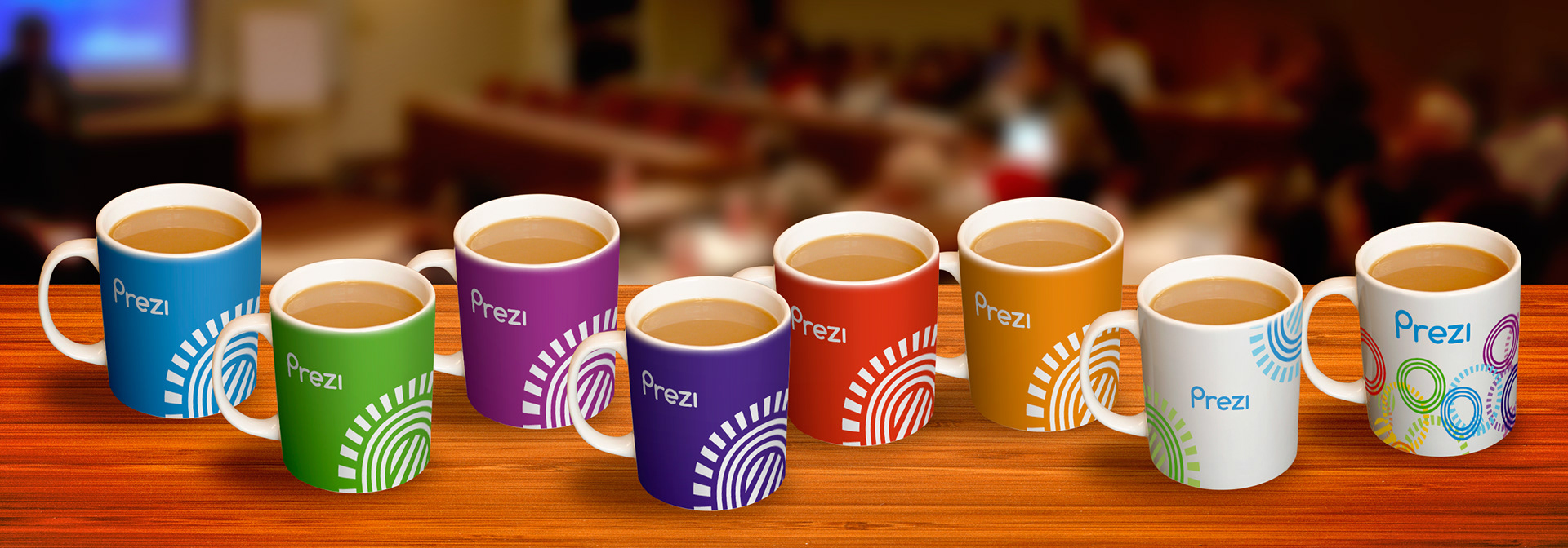
With playful colour-combinations and rotating the middle part of the logo 45 degrees I wanted to represent the company’s young and forward-thinking spirit.
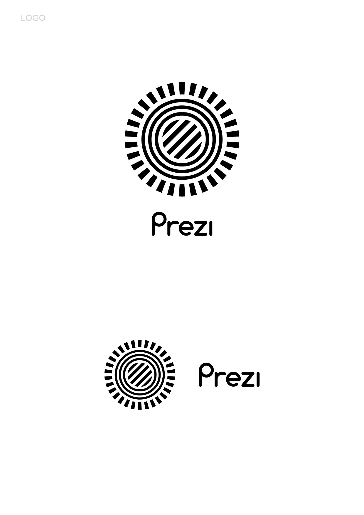
After many years, the company currently uses another version of my old design, where the middle part is not rotated with a different font, sometimes in one blue colour or with shades of blues, with a further simplified version for favicon.