my data visualization tool, which was never born
I began working with WordPress in 2006 as a web designer, where I learned to create basic websites and got intrigued by website performance and content impact on social media. Back then, tools like Google Analytics, Twitter, and Facebook were just starting. Around 2011, companies like SumAll offered ways to track social media stats. Remember them?

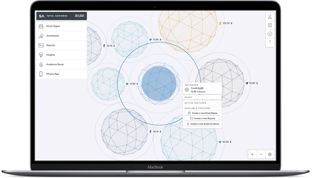
Sumall.com in 2014
As a visual thinker — I focus on design elements, not numbers. I believe numbers should be presented only when needed or when diving deep into data. I wanted to create a tool, which could help to map your thought process about projects, showing connections between their features and statistics.
For example:
· Which Twitter post boosted the activities on my website?
· Is there any correlation between the profit of a shop and a Blog post on the website?
· Which project performs better?
I designed the first version of my idea in 2014. I was in a rush, wanted to see my vision as soon as possible, I have not done any market research. I had no idea SumAll existed.
The name of that project was “Pebble”.
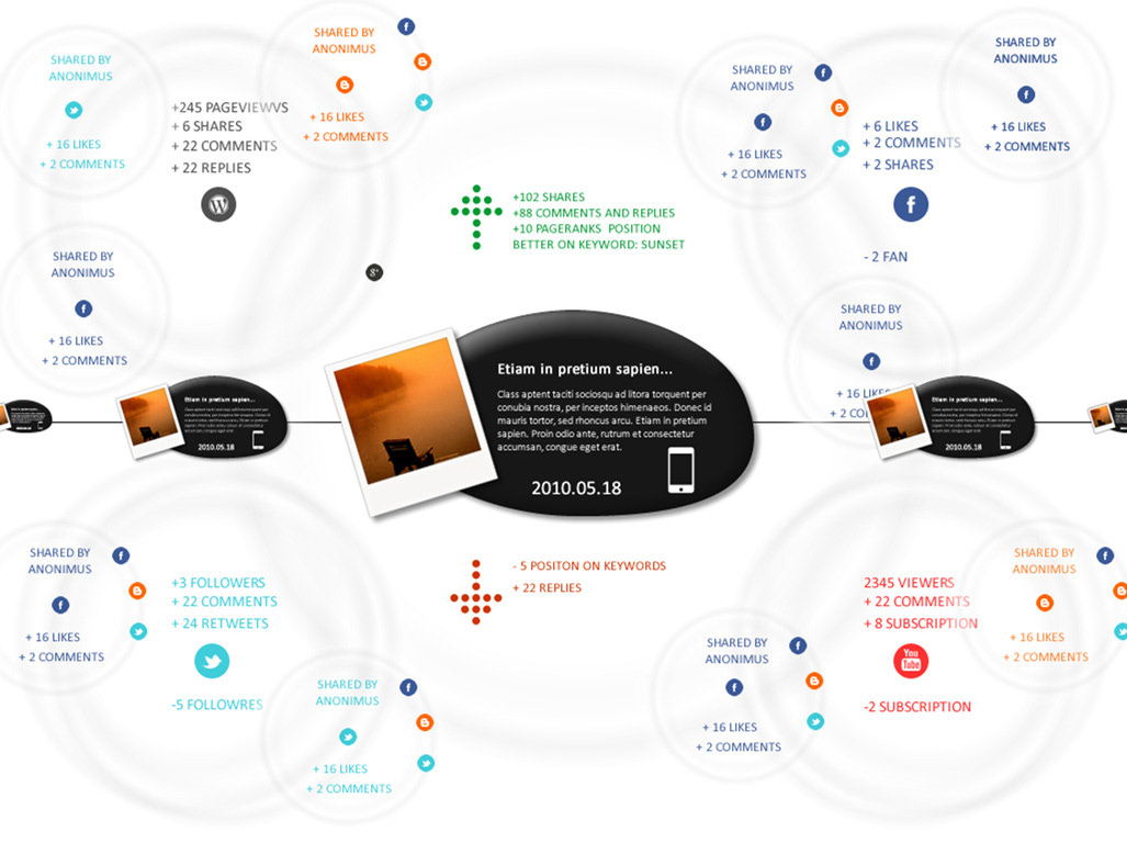
“Pebble”, 2012
It is never got published, so I was surprised when I got a newsletter from SumAll about the upcoming updated version of their service, and I have found a visual similarity between these too. I know that is all happened by accident, but still: I had a feeling that I was on the right path.
New version of Sumall.com
I forgot about the project for weeks; I was an employee at this time, living in Malta and one day I was sitting behind a Black woman on the bus, who had colourful braids.
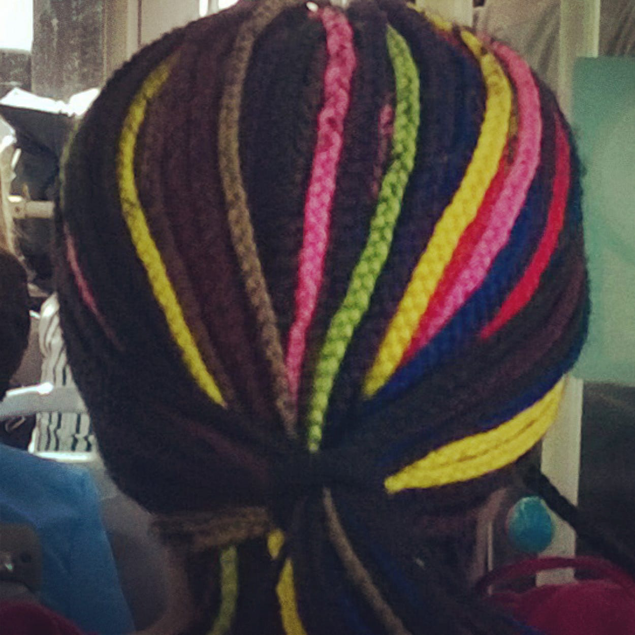
This gave me a new idea for better data visualization. I had a sketchbook with me, and I draw a quick version for the new layout.
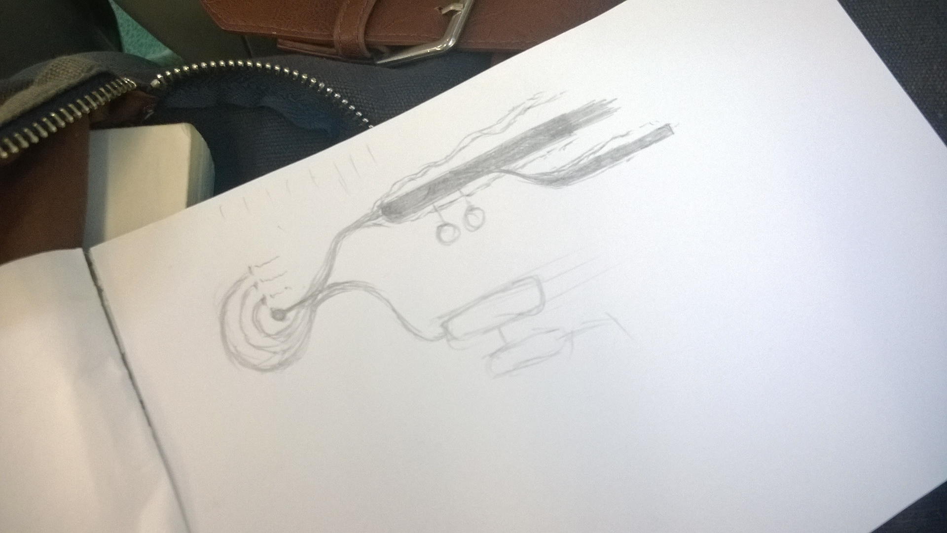
My sketchbook
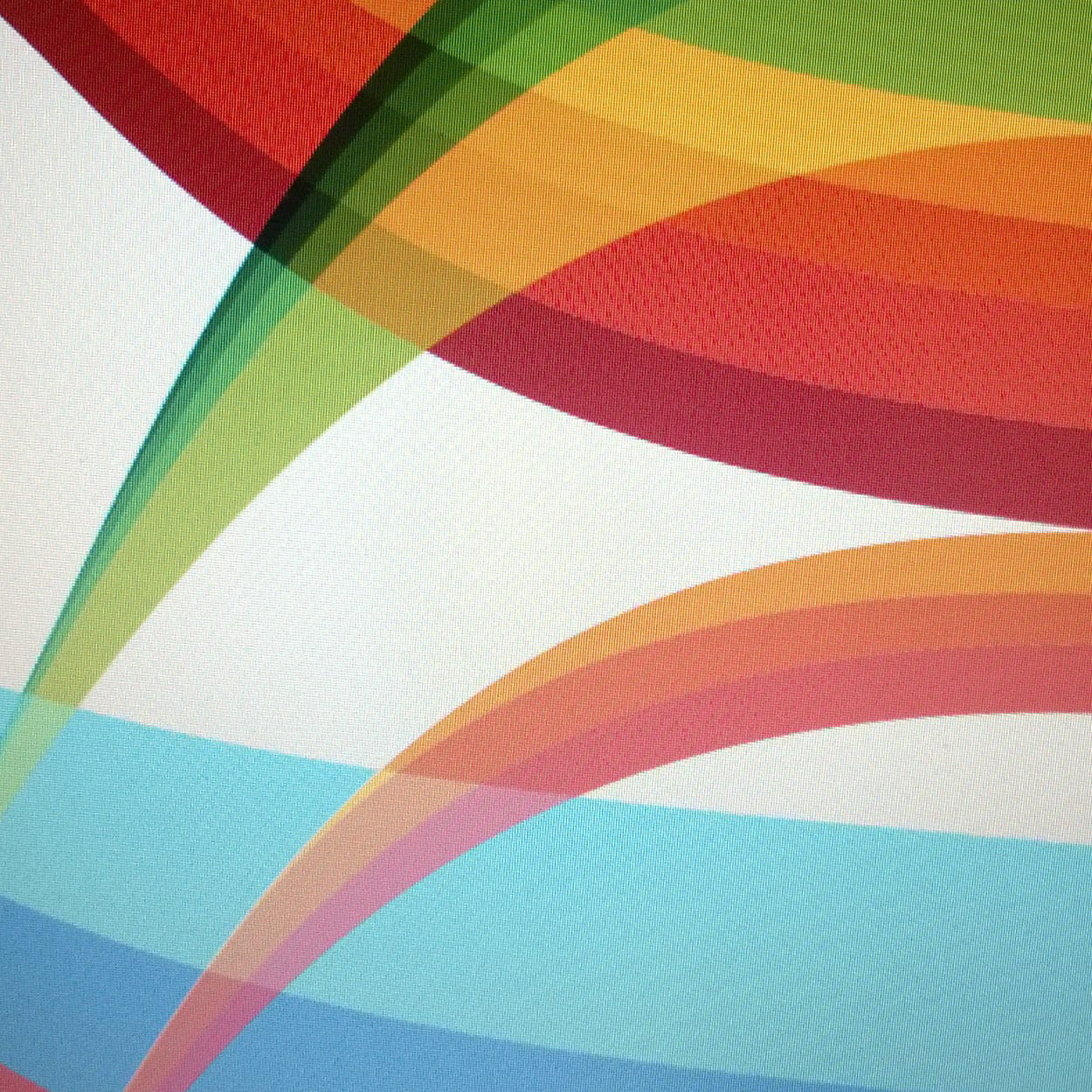
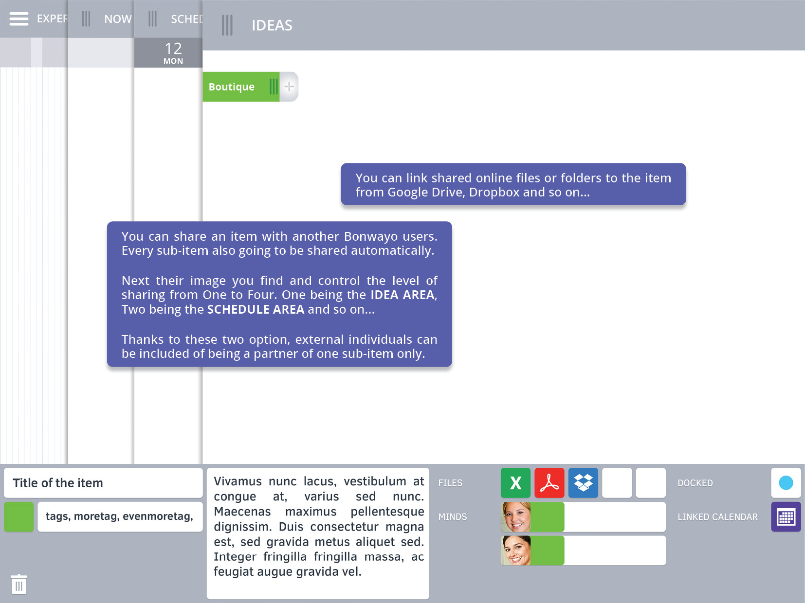
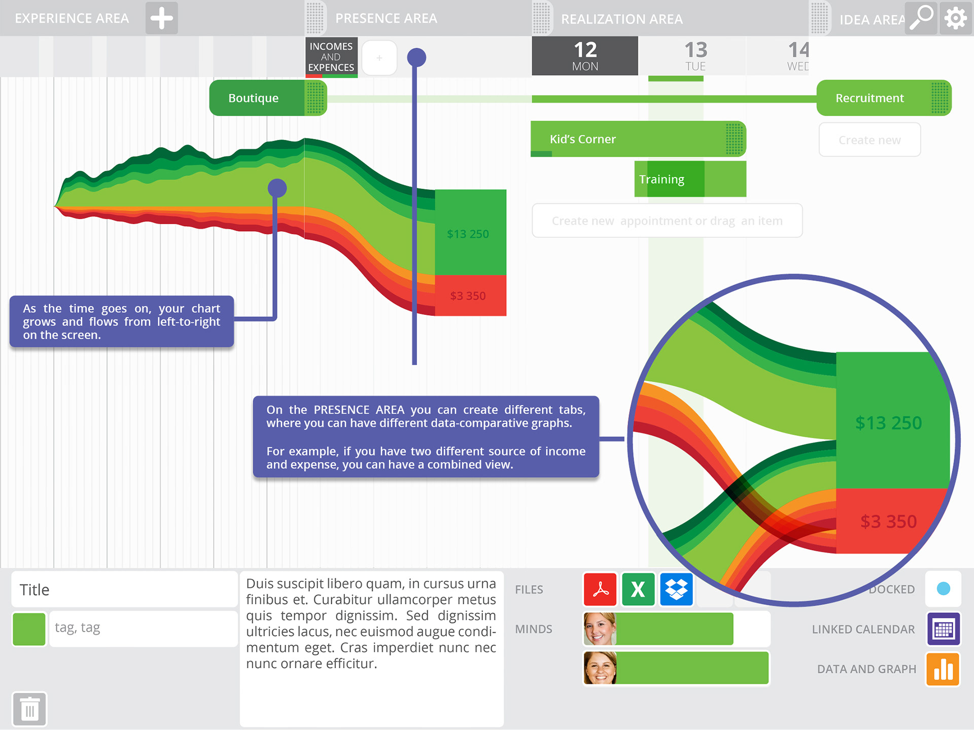
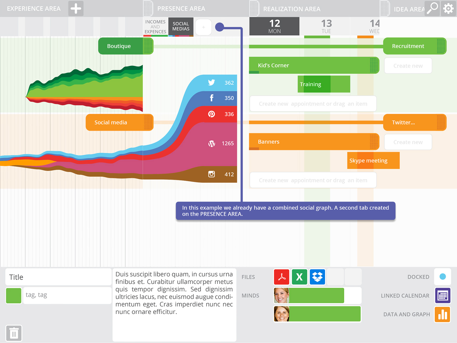
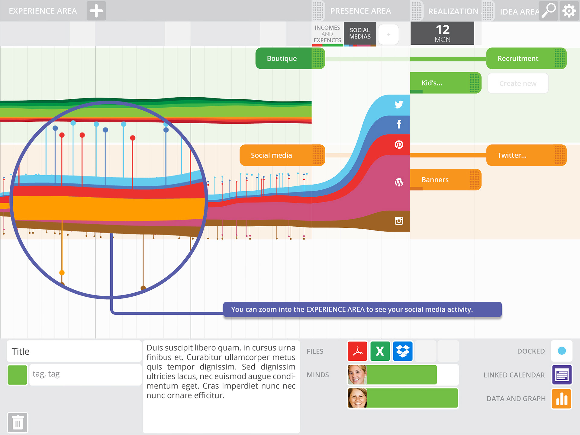
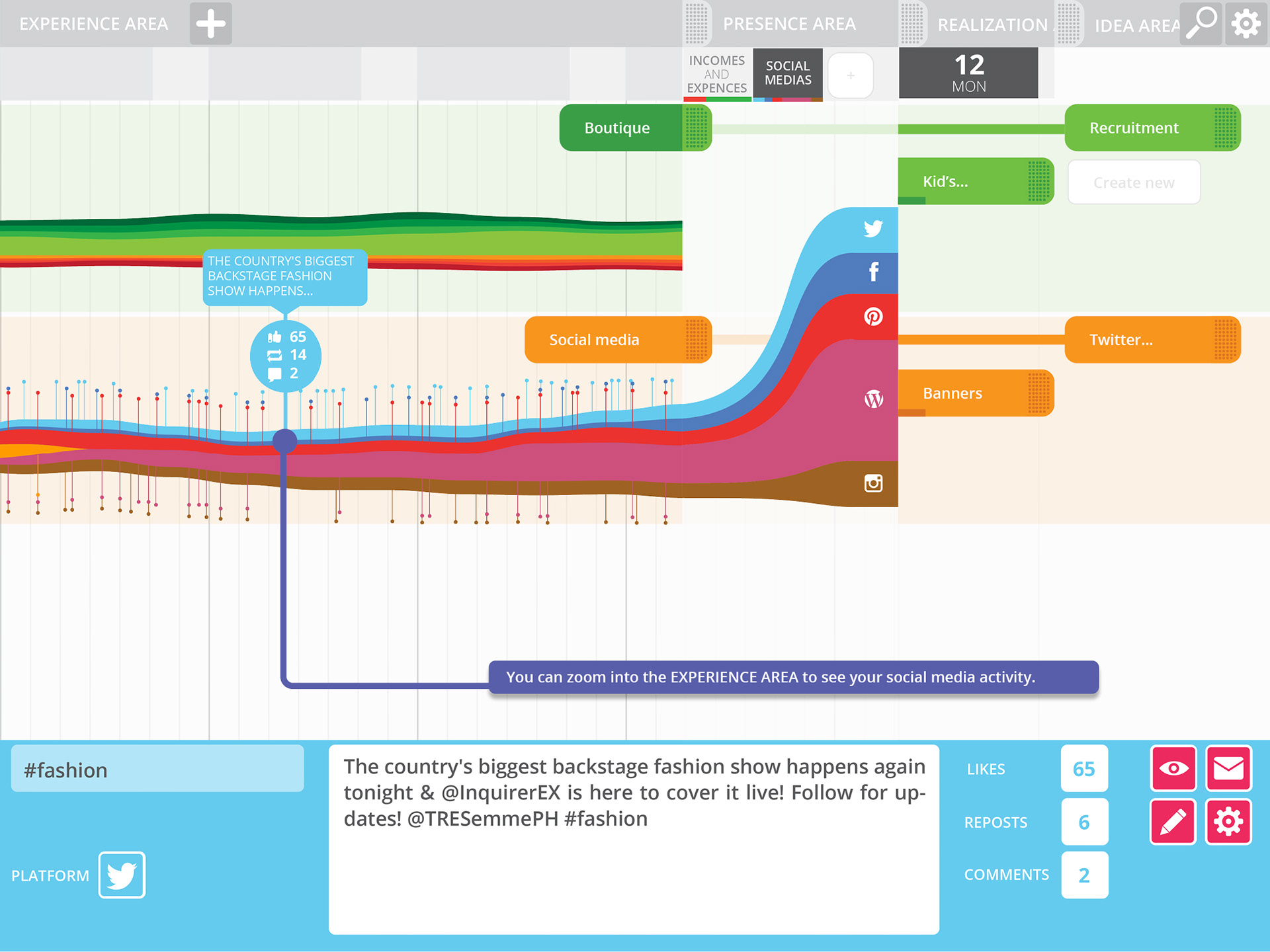
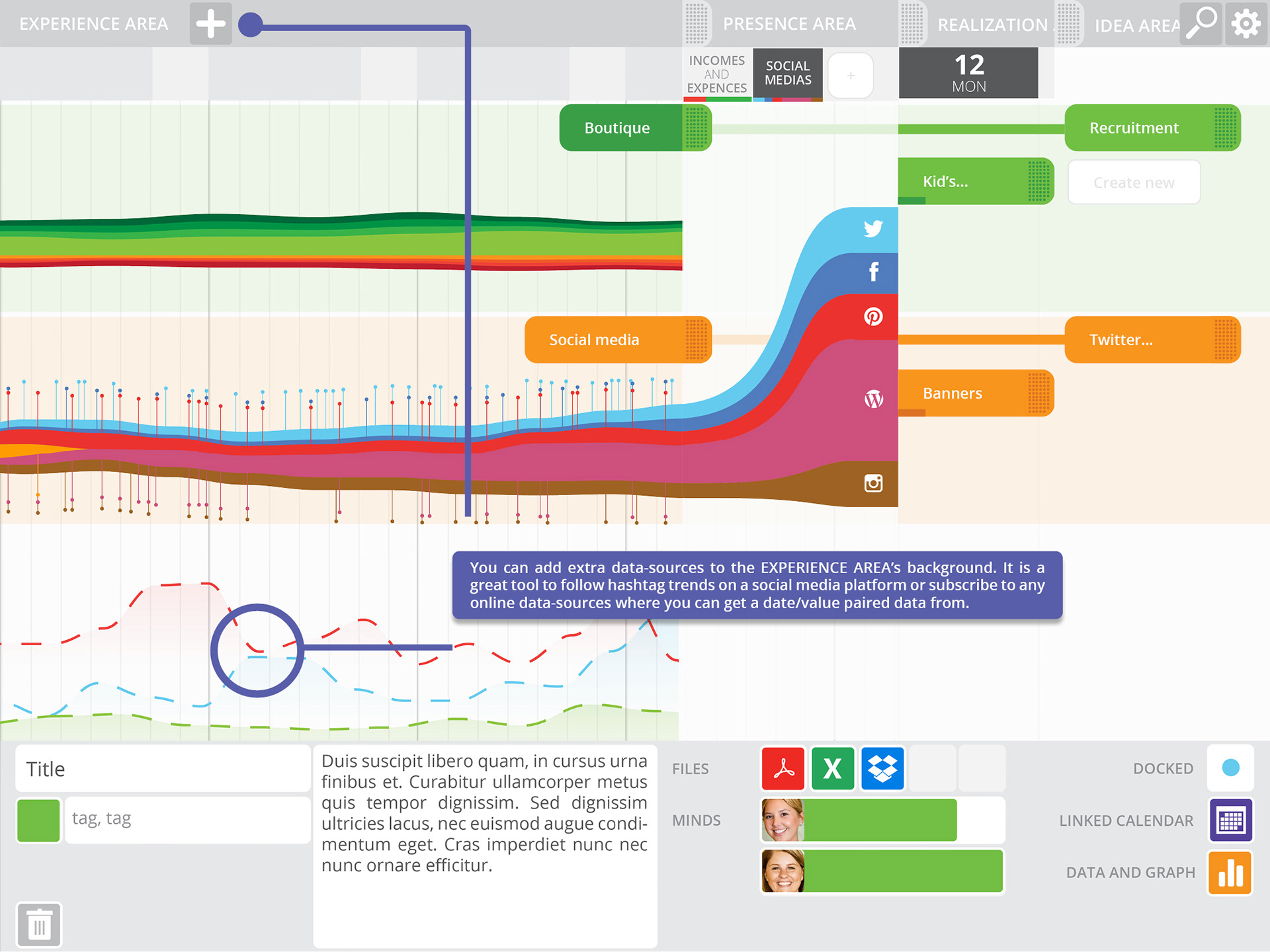
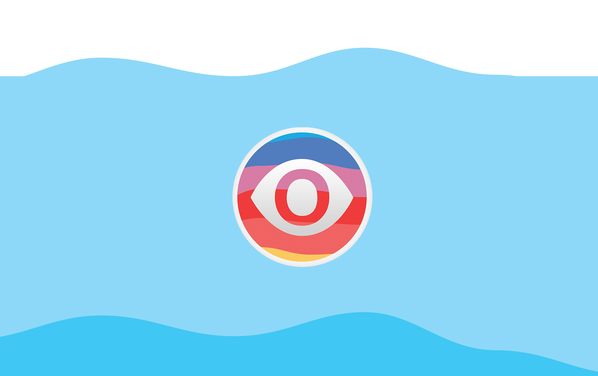
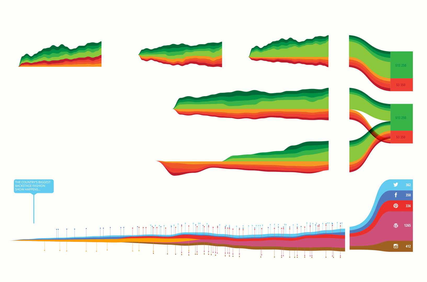
This led me to the idea for a tool, and I name it “Bonwayo”, which means “seen” or “visual” in Zulu. The main idea was to represent all social media sources with one braid, where every channel gets its own colour (Blue for Twitter) and the thickness of the area represent increases and decreases in metrics like followings; the overall thickness indicating the whole online presence. “Pins” would represent posts.
Other braids with red-to-green colouring represent other data-sources, like Google Analytics, or revenue of a store. The whole screen would look like a seismograph, showing the posts impacts on everything.
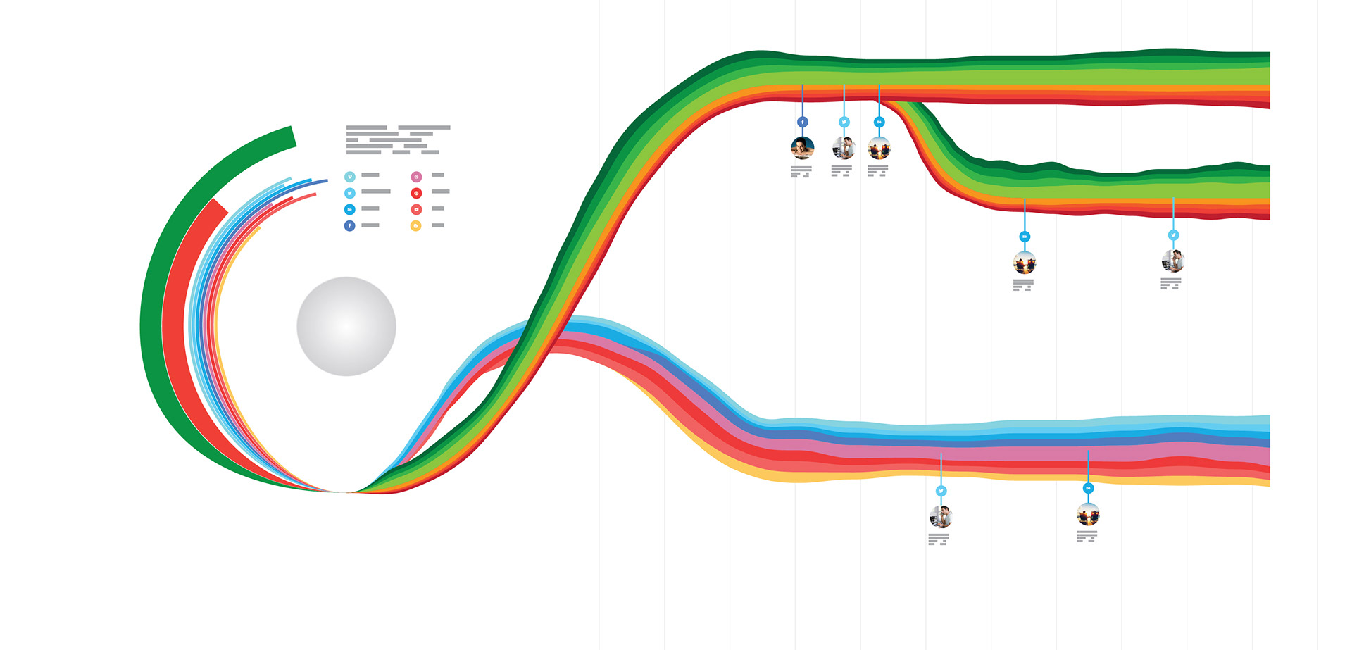
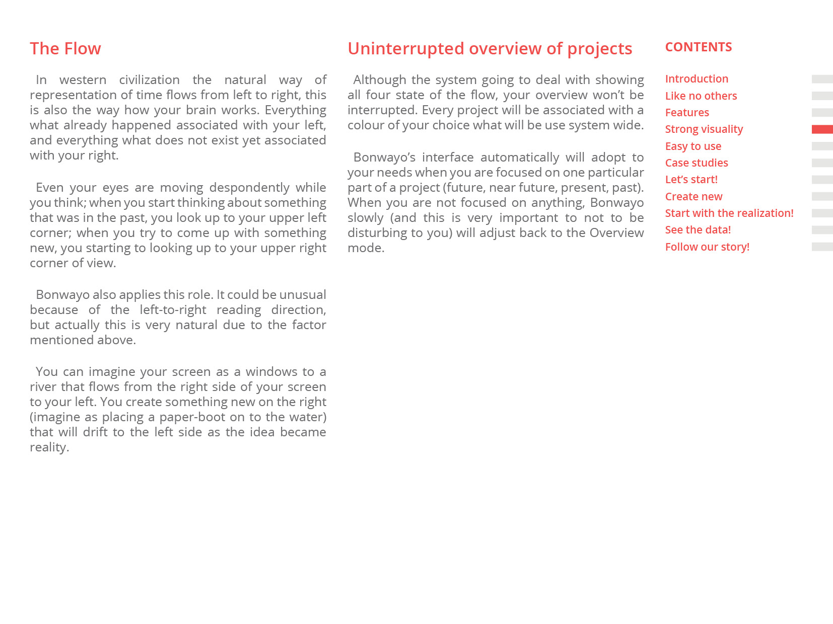
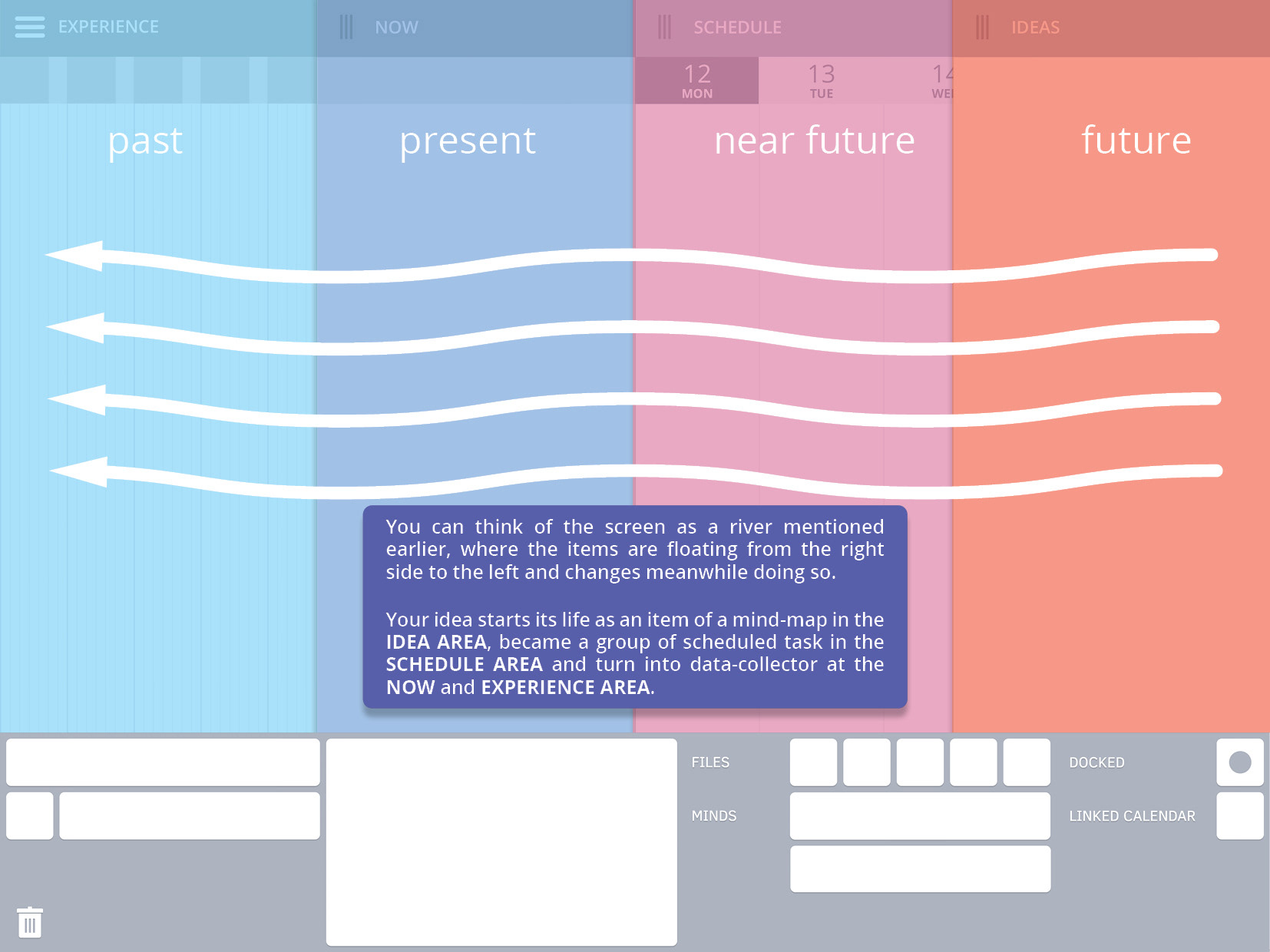
I developed further the idea, but the obvious left-to-right representation of time did not make any sense, I felt uncomfortable with it. So, I flipped it. Suddenly, in the updated version with the right-to-left order everything had fallen its place.
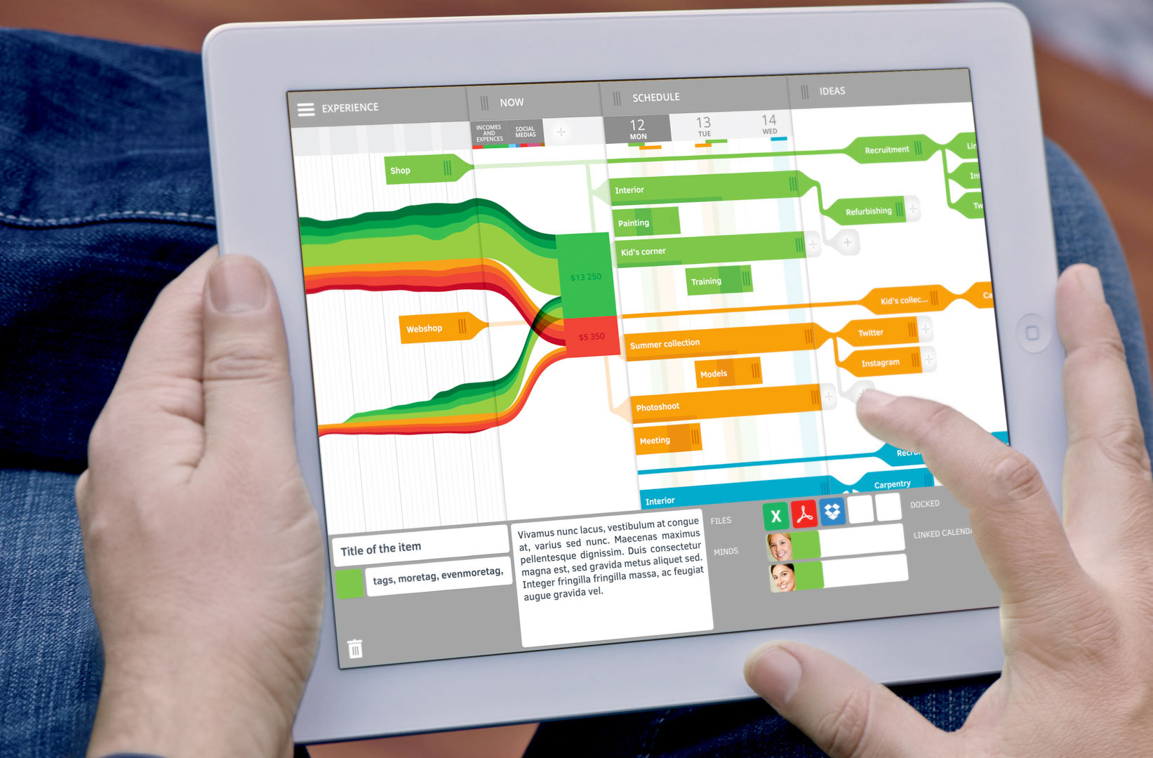
The screen suddenly reminded me of a river; whatever new idea you would come up, and placed on the IDEA area, it would flow to the left trough the SCHEDULE — NOW — EXPERIENCE state. One idea would become a data at the end, a metric.
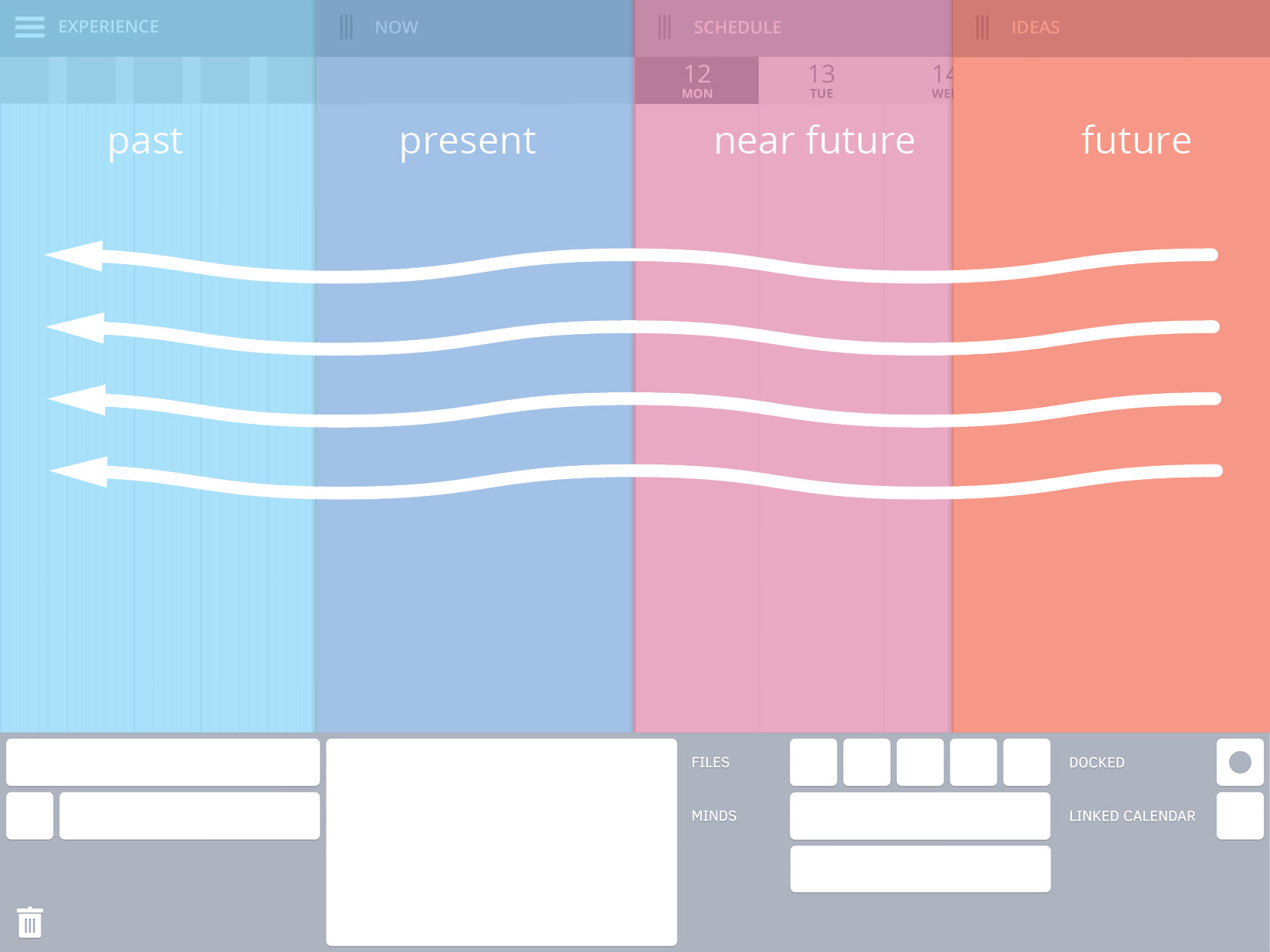
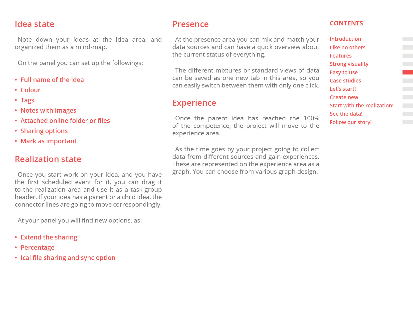
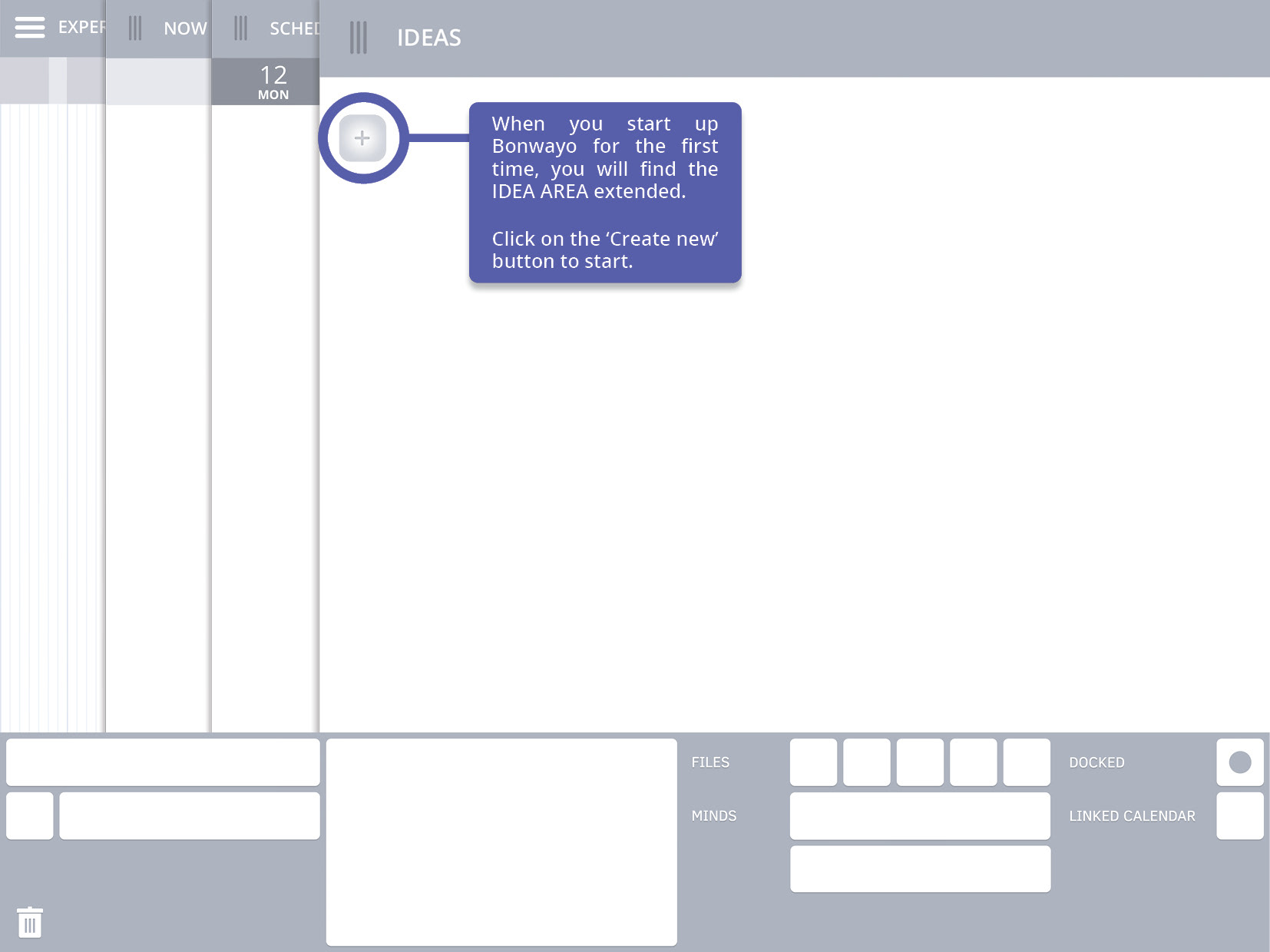
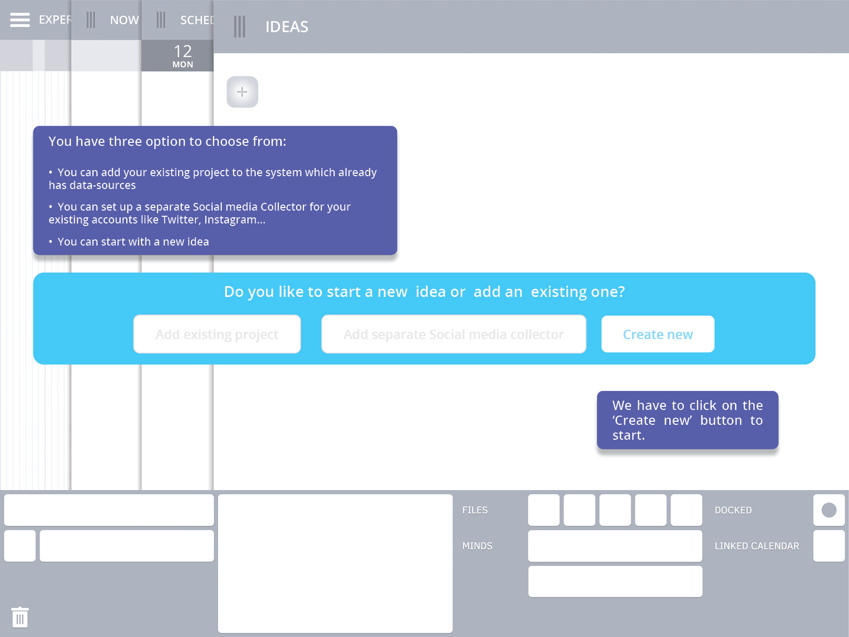
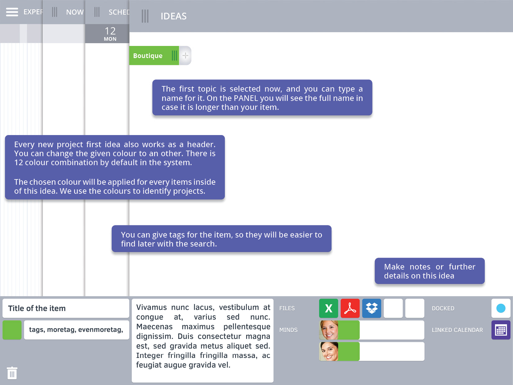
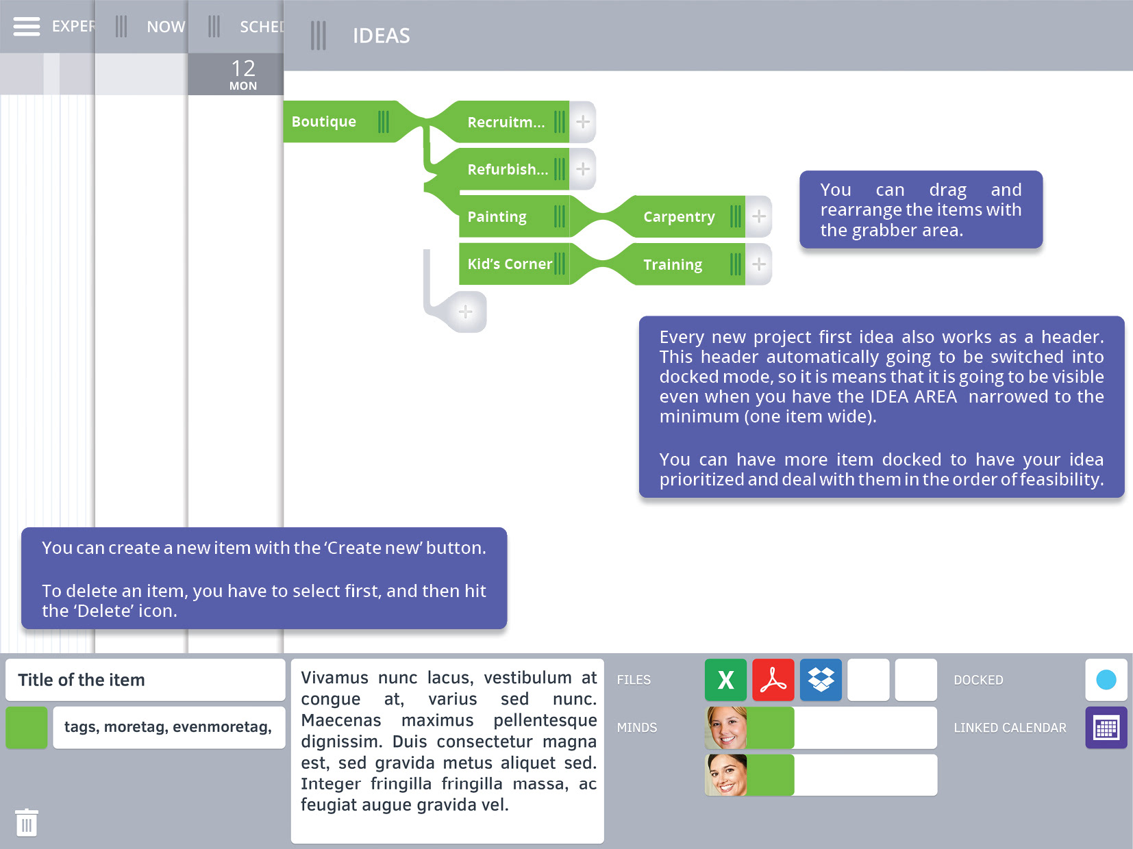
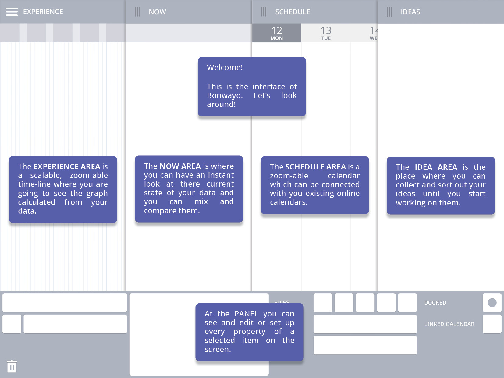
IDEA
Note down your ideas at the idea area and organized them as a mind-map.
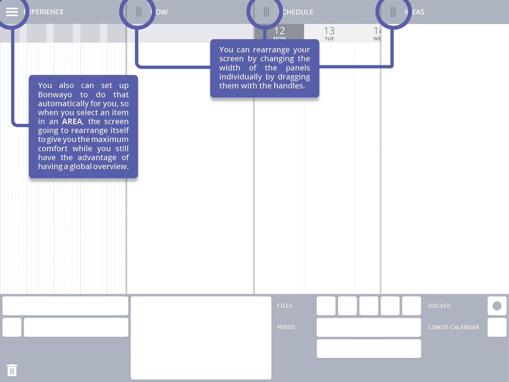
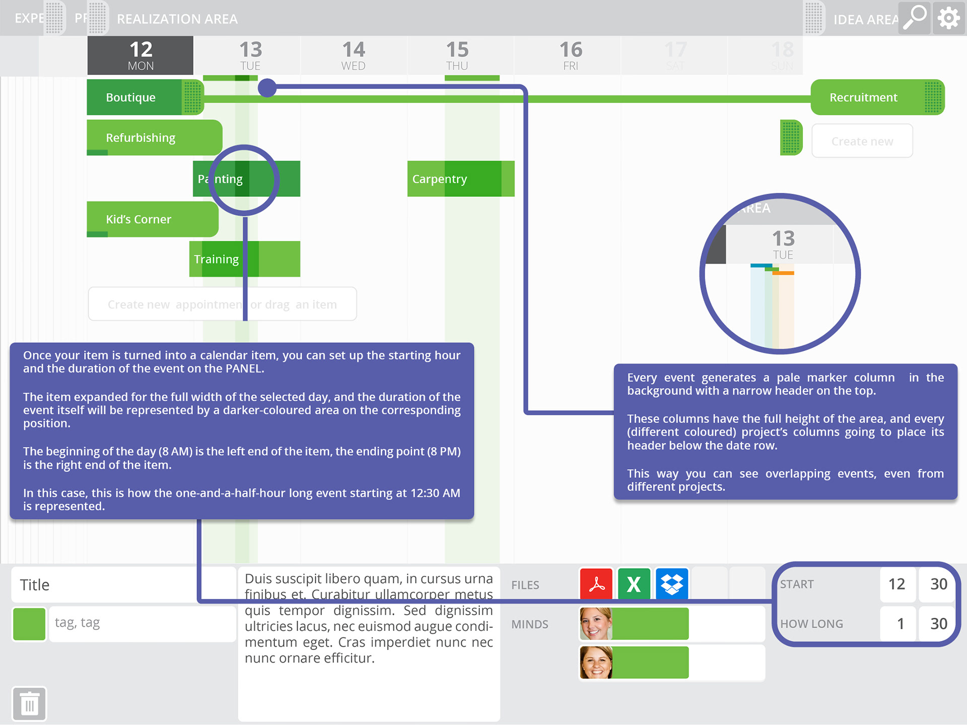
SCHEDULE
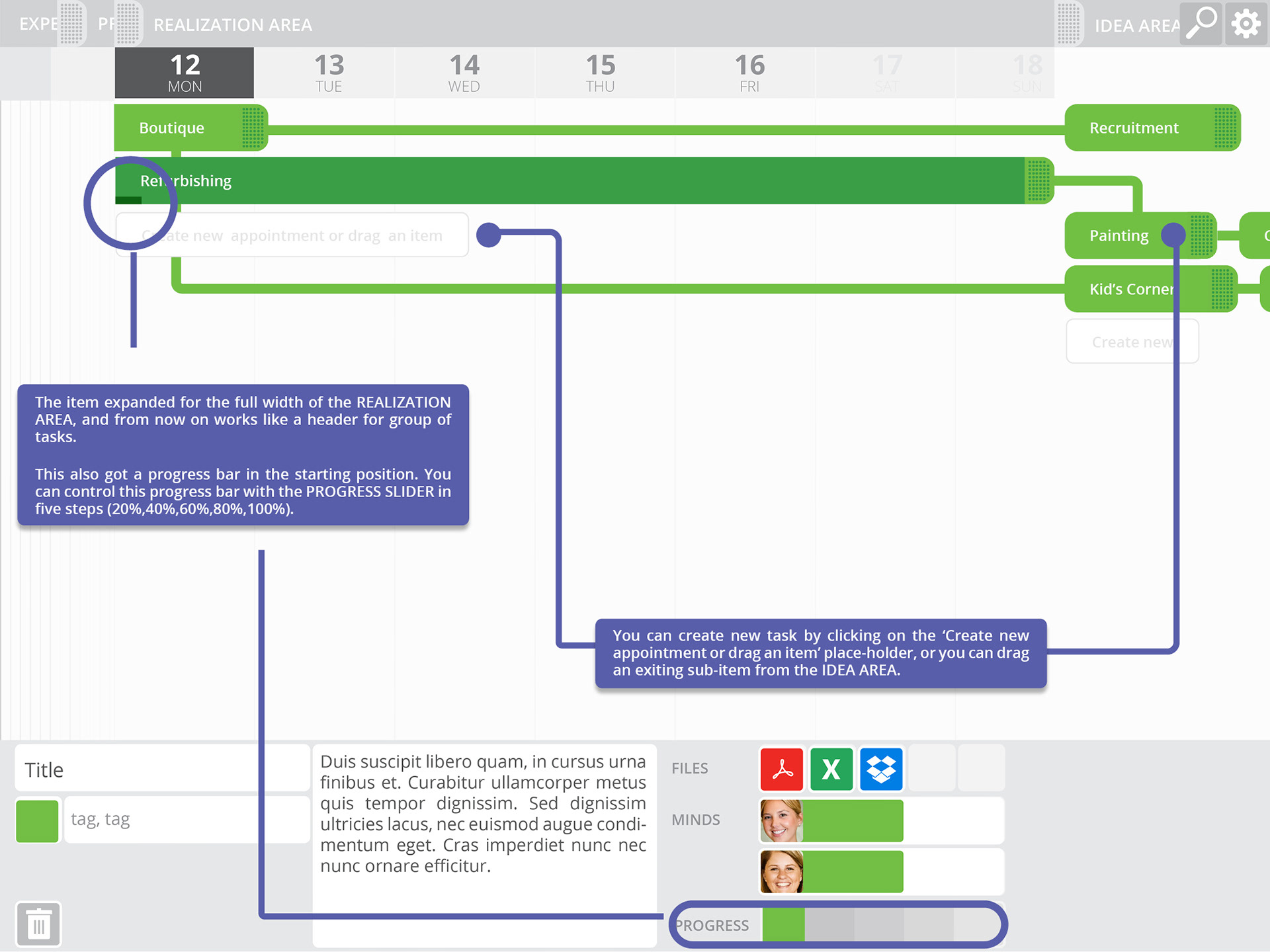
Once you start work on your idea, and you have the first scheduled event for it, you can drag it to the realization area and use it as a task-group header. If your idea has a parent or a child idea, the connector lines are going to move correspondingly.
NOW
At the presence area you can mix and match your data sources and can have a quick overview about the current status of everything. The different mixtures or standard views of data can be saved as one new tab in this area, so you can easily switch between them with only one click.
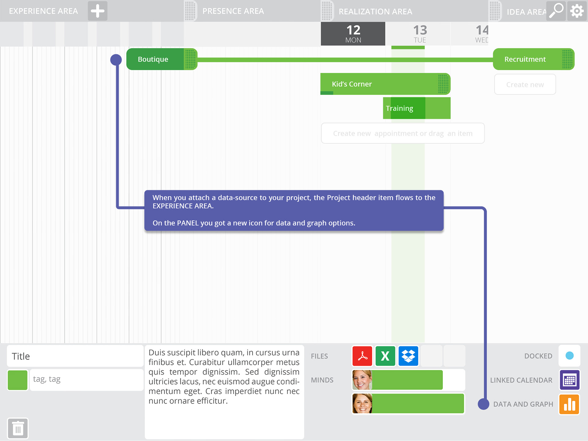
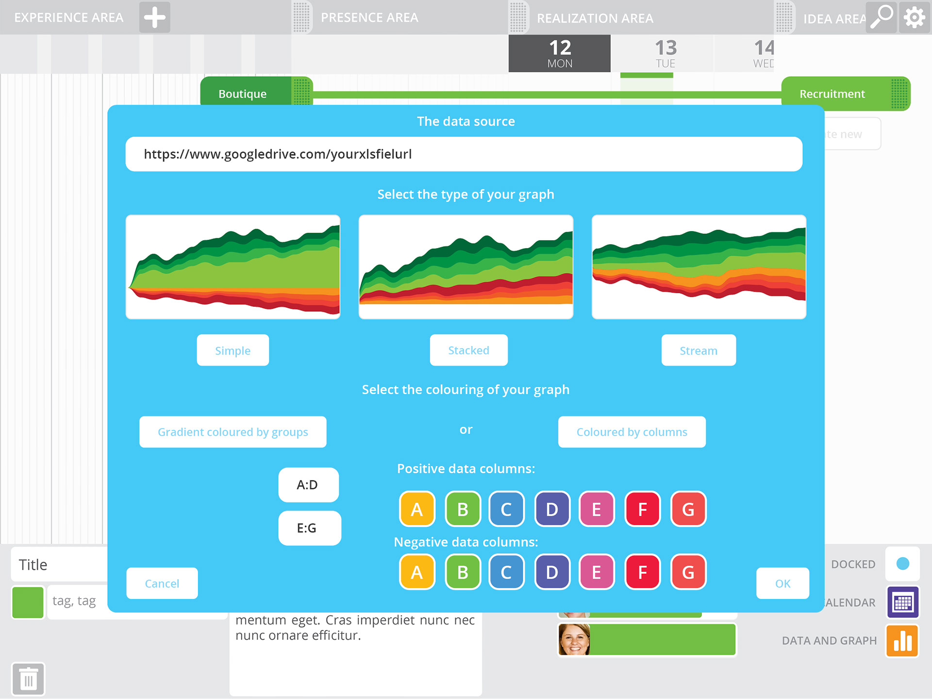
EXPERIENCE
Once the parent idea has reached the 100% of the competence, the project will move to the experience area. As the time goes by your project going to collect data from various sources and gain experiences. These are represented on the experience area as a graph, and you can choose from various graph design.
Although I spend tremendous number of hours just to see my idea in action, I have not had any idea how to start a start-up or find a developer.
That how far I got alone with my tools back at those days. I had a small and slow laptop, Figma or Adobe XD were not a thing. I used Illustrator, InDesign, Photoshop and even started to create ab animation with After Effects:
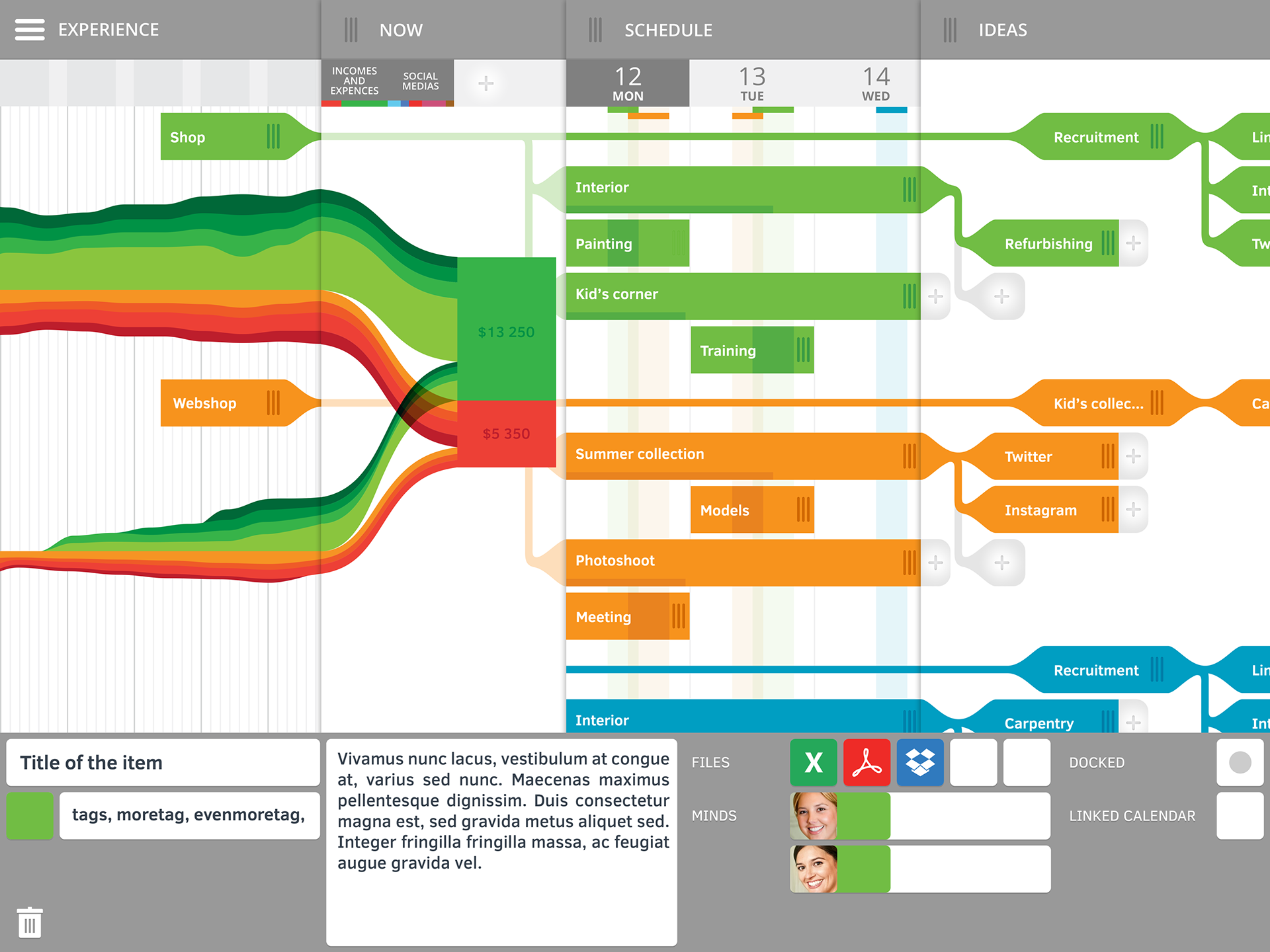
Dragging one IDEA to the SCHEDULE pane
In 2018 Microsoft introduced a similar function (and discontinued) where you can schedule your Microsoft To-Do Tasks in Outlook.
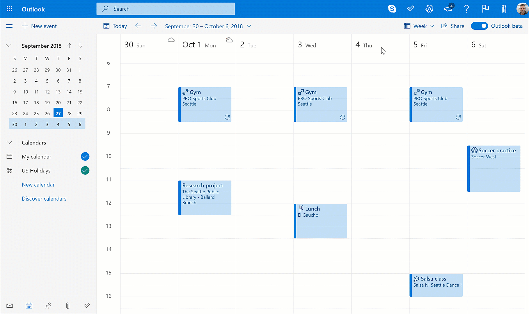
Scheduling your Microsoft To-Do Tasks in Outlook

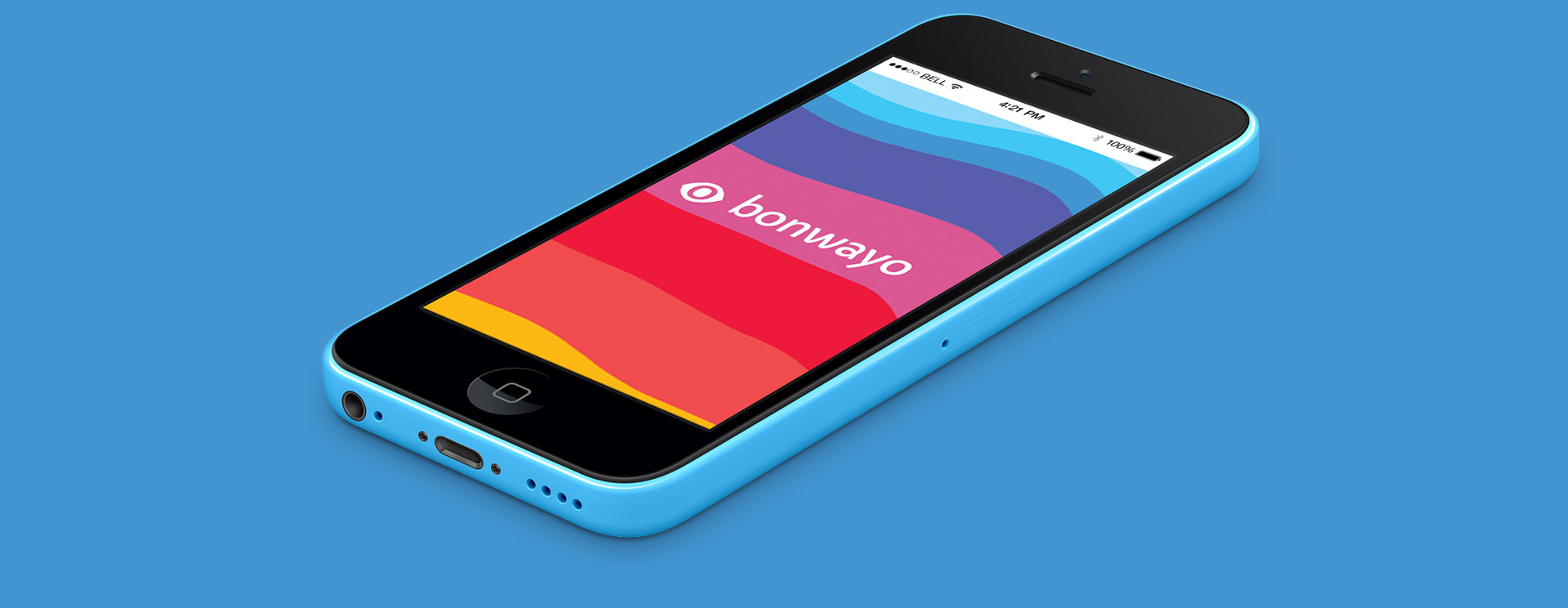
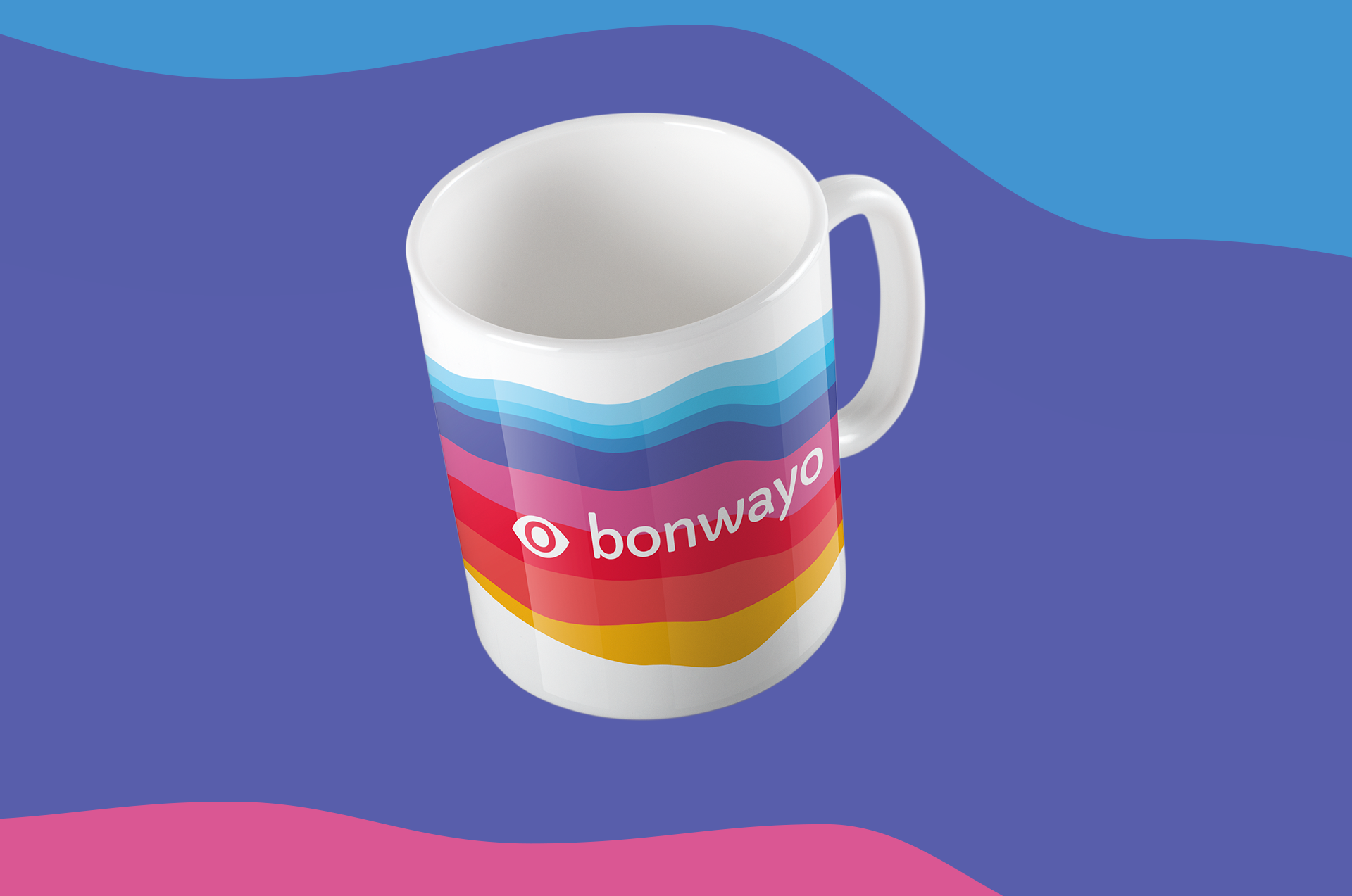
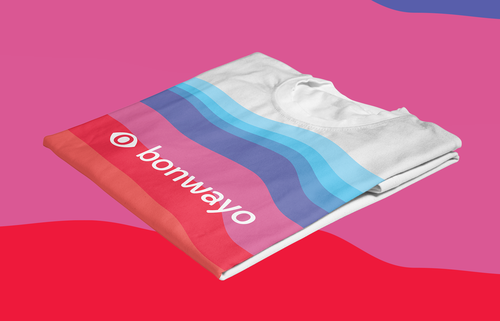
Moodboard for the Bonwayo branding
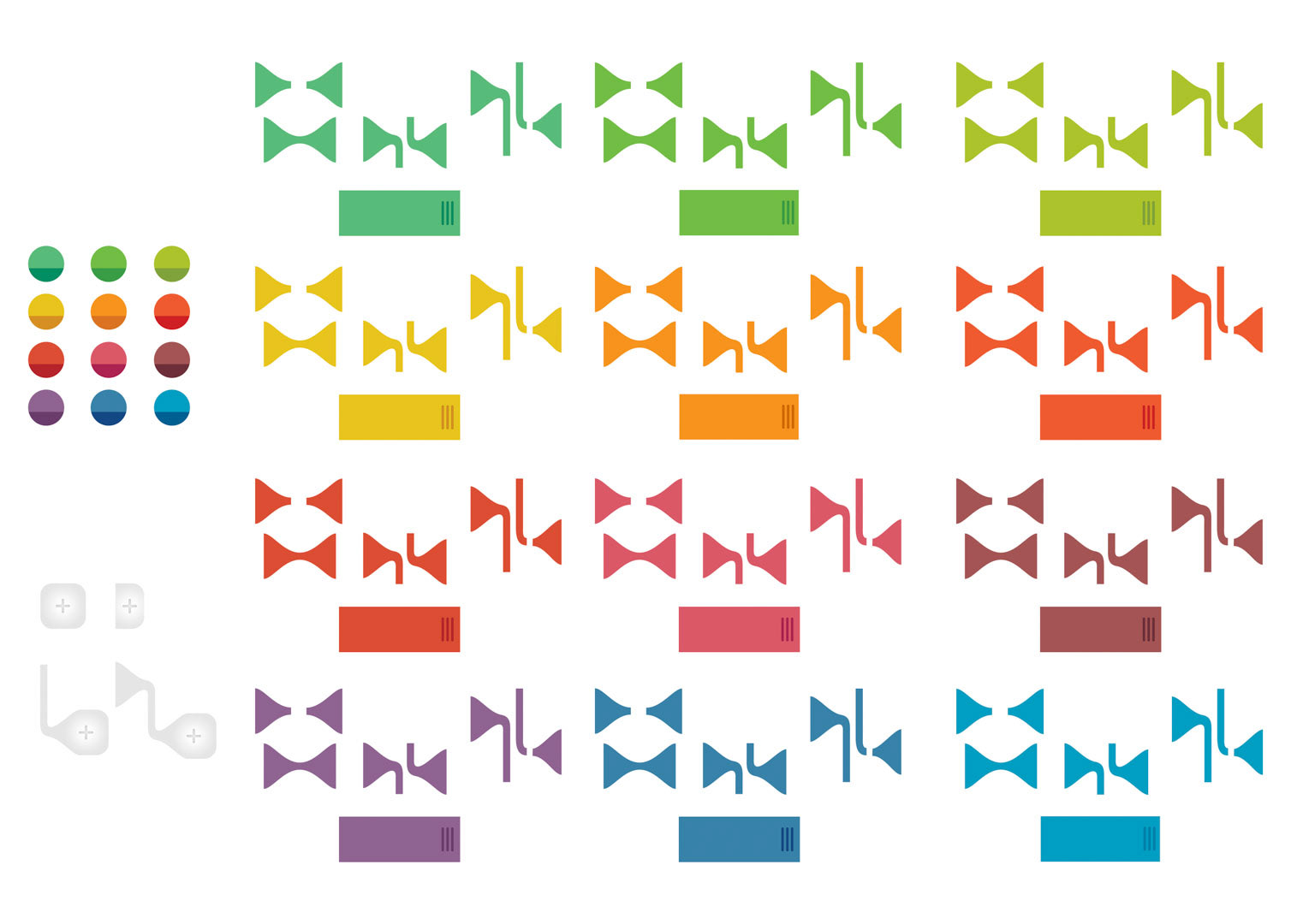
Branding

UI elements
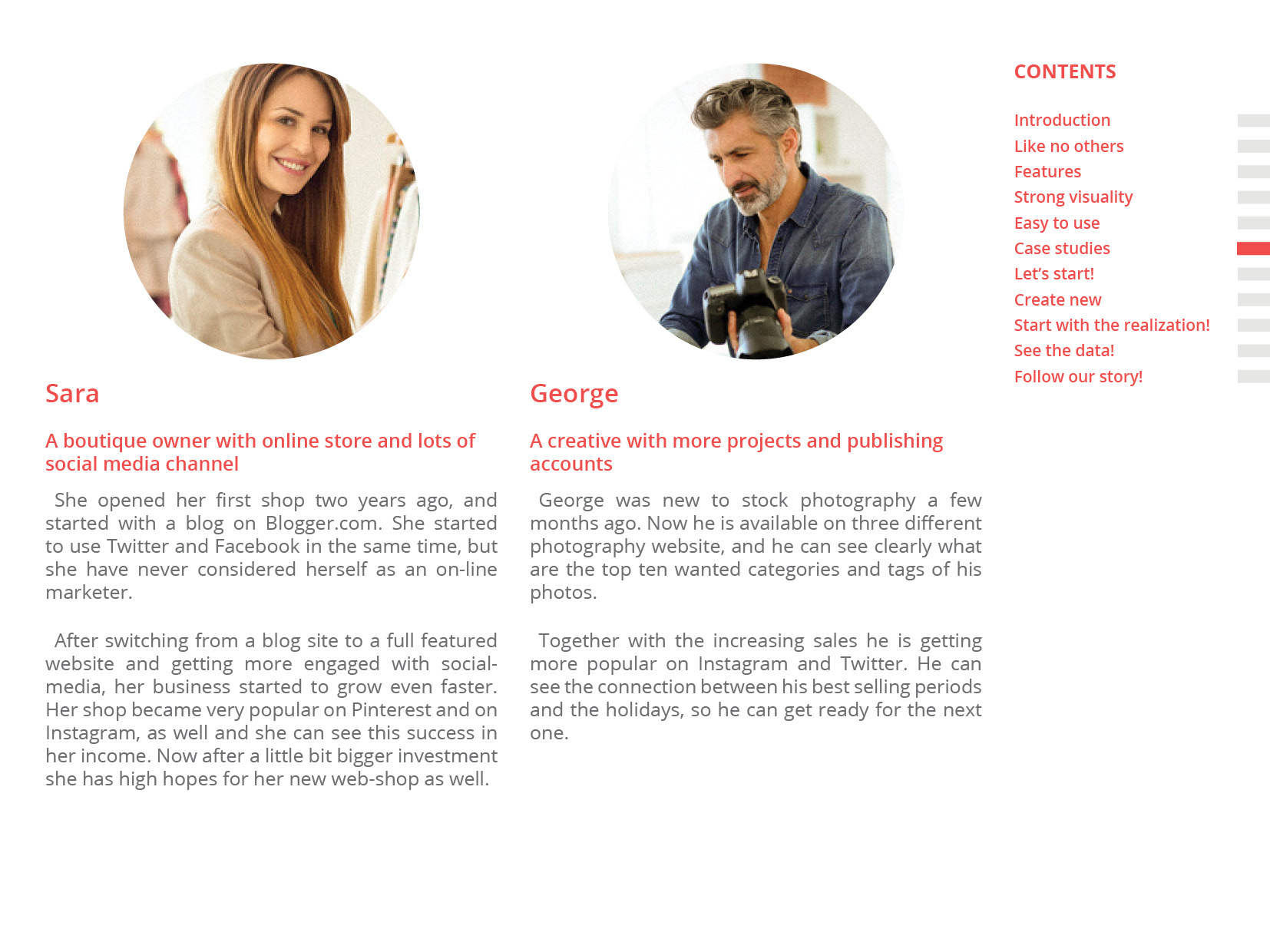
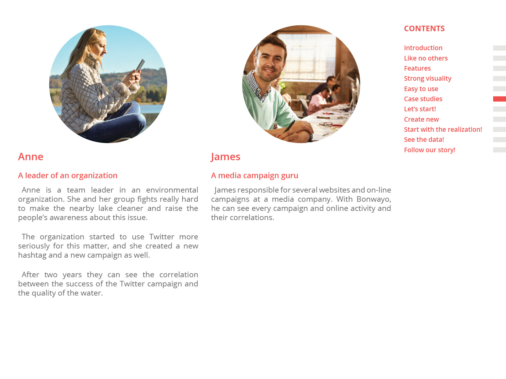
User manual pages